You don’t need a degree in graphic design to create amazing graphics. You just need to understand some basic graphic design fundamentals. That’s what we’re going to review in this article.
There are four fundamentals of design:
- Color theory
- Imagery
- Typography
- Composition
Want a crash course in graphic design beyond the fundamentals of design? Take Digital Marketing Institute’s full Graphic Design Course on HubSpot Academy.
4 Fundamentals of Graphic Design You Need to Know
1. Color Theory
Color is a critical element to get right in your designs. It’s used to attract attention, convey meaning, and of course for aesthetics. We don’t usually even think about the colors we look at; we judge things quickly and often measure instantly whether something is desirable, professional, nice, ugly, or even weird based upon its color.
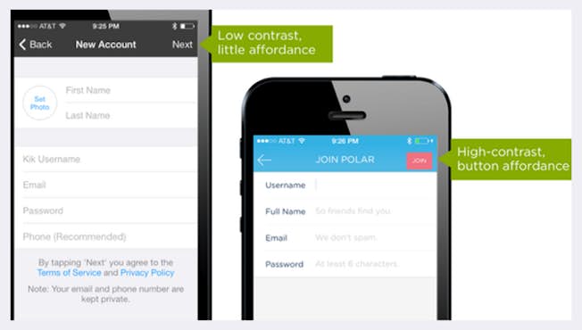
The most important thing to think about using colors is the contrast between them. Contrast refers to how well one color stands out from another. You can use contrasting colors within an image to make text stand out from its background for example. Complementary colors, like yellow and purple, or blue and orange, for instance, provide maximum contrast with one another.
Contrast can also be used to guide people’s actions; to let people know what you want them to do. If you want to increase ‘click-through,’ make sure that there’s a strong contrast between the call-to-action button and the rest of the design.
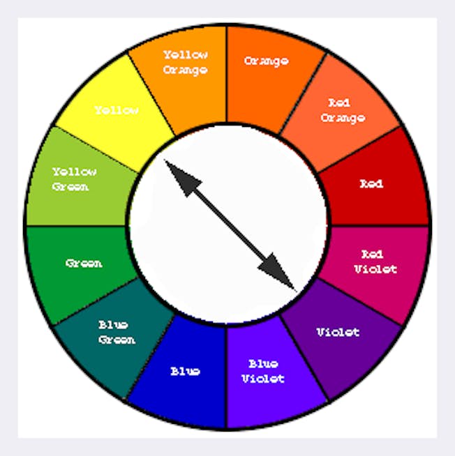
You can check how colors contrast using a color wheel. A color wheel shows how colors are related visually. For example, complementary colors are those opposite one another on the color wheel.
Colors also give visual cues meaning. For example, a green button usually indicates an affirmative action, like ‘OK’ or ‘Accept.’ But if you were to design a large ‘Accept’ button and make it red, it could really confuse the user, and in some cases, the results could be disastrous.
Let’s talk about the most common colors used by brands, and what meaning or feel they can invoke from their audience.
- Red can trigger powerful emotions – both positive and negative, to create a sense of urgency – which is why it’s effective with sales. It also encourages appetite, so it’s used regularly in the fast-food sector.
- Orange, another warm color, is considered light and fun, so it suits less “corporate” - feeling brands. Darker shades of orange are associated with autumn, which lends itself to more “earthy” brands.
- Green is easy on the eye and synonymous with health. So you’ll often see it used by brands promoting health products such as pharmaceuticals or food brands. It can also be linked to growth or power such as with financial or military organizations.
- Blue, on the other hand, has a calming effect on the mind and is the color of reason, but also of strength, wisdom, and trust, which is why it’s used so widely. It’s a safe option for brands, but brands need to consider if it will help them stand out in their space.
- Pink has historically been used to portray femininity, like with Barbie and Cosmopolitan Magazine. But nowadays, a lot of mainstream brands use it regardless of their audience, such as Lyft. It portrays youth, but also inspires comfort and represents hope. Pink has been used successfully in many industries to “break the mold.”
- Black is synonymous with luxury and power. While combining with a small amount of a bright color, it can add energy to sophistication. Black is well suited to some industries like fashion, for example – but perhaps not to others, like health.
- White and silver represent cleanliness and has often been used for a modern look and feel. It needs to be used carefully though, as it can lack personality. Many brands use white to complement another, more dominant color. When executed well, adding white to your design offers a modern, simplistic, and clean look.
2. Imagery
We’ve seen that images lend themselves very well to digital media, but there are some general points to consider. Firstly, audiences respond well to images with people in them. It helps create an emotional connection as campaigns are targeted at real people and your imagery needs to reflect that.
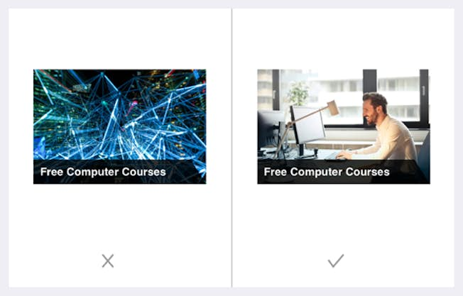
Image quality is also very important. When customers are considering a purchase online, they want to be able to scrutinize images that give a high level of detail of the product. People often abandon an ecommerce site because the product image is not of a high enough quality to help them make a decision. It negatively affects their impression of the product and you can lose the sale.
So when you choose images as part of a design, make sure that your images are high definition, or HD, and are appropriate to the device your audience will use. They should not be stretched or pixelated.
Next, remember that most web traffic comes from a mobile device – so it’s very important that you test your graphics on mobile to make sure they still look okay on smaller dimensions. If not, consider creating a separate version of your graphic specifically to show to people who are using mobile devices.
Here’s a guide to the best image dimensions for different screen sizes:
- Banner Image: 2000px wide and 800px long
- Slider: 1920 px wide and 890 px long
- Icon: 300px wide and 300px long
- Post/ Event: 425 px wide and 220 px long
- Portfolio: 1920px wide and 768px long
3. Typography
What about the typography, or fonts you use? It’s important when choosing a font for your visual, not to try and do something wildly different. Readers expect to see familiar fonts, such as system fonts – for example, Arial, Helvetica, Roboto. Use a maximum of two to three font families on a single webpage, and even fewer for your ads and images. Notice the image below. How many fonts can you count in it?

What’s a font family? A font family simply means a grouping of fonts defined by commonly shared design styles. For example, roboto is a family which has bold, italic, or thin styles.
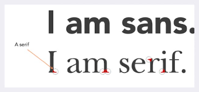
You will also come across “Serif” and “Sans-serif” fonts. A ‘serif’ is a small, decorative line added to a character. The most common serif font is Times Roman. A common font without serifs, or ‘sans serif,’ is Helvetica. Serif fonts are used to improve the readability of text in things like blogs, articles or newspapers. Try not to use more than 10 words for each line. For headings, consider using a heavy-weight, sans-serif font with a larger size. Ensure the right emphasis – or size and ‘weight’ – is applied to the text according to its priority.
It’s also best practice not to add text directly to an image, particularly in web design, and instead to work with your web team to overlay responsive text on the image. Why? The problem with text on the image is that, if the image is on mobile, then sometimes the text is too small to read.
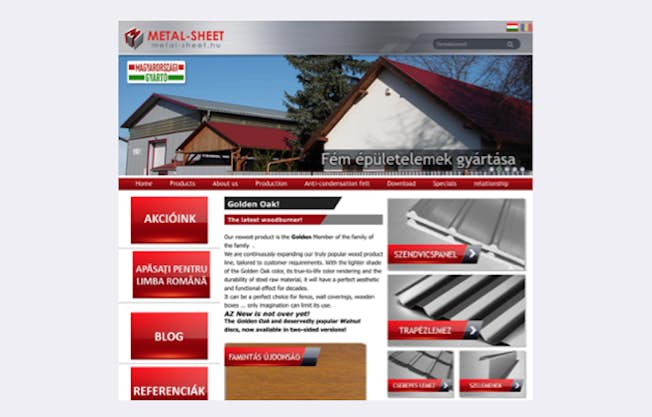
Another consideration is localization. Because text is fixed, it can’t auto-translate. The below image shows a site translated to Hungarian via Google Translate. You’ll see the calls-to-action aren’t HTML – instead, they’re images that include the text, which means the text can’t be translated.
If you need to add text, for example for a social media image or blog image, ensure that there is sufficient color contrast. For example, this website here has been analyzed with two variations of the background color. The second has a better contrast, which makes the text more legible. A quick ‘hack’ to add better background color contrast is to darken the border, like with this example.

Remember: it’s the combination of an image plus your message and how it’s worded, and even the fonts you use, that can mean the difference between success and failure in reaching your audience.
4. Composition
Once you know the colors, imagery and fonts for your image, you need to put them together in the best way possible – and that’s where composition comes in. Your goal should be to make the design as simple and elegant as possible. Removing clutter and visual noise helps the user to focus on one task at a time.
When you have taken away all unnecessary information, you should make sure that your content – meaning all your images, buttons, color, shapes, and text– is ordered in a clear and logical way.
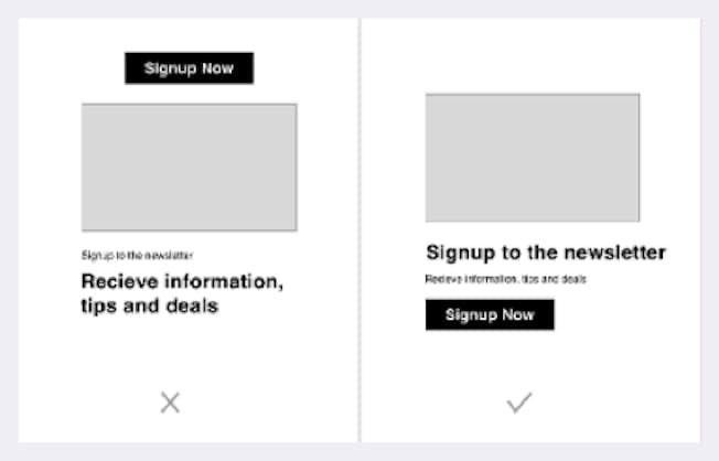
Each piece of graphic design content should serve one purpose. When you’re creating a design, ask yourself: “What is its purpose?” Should it lead the user to do something? Inform them?
Nudge them to keep reading? Fill in a form? Or is it just there to give them information? Even if you have multiple goals in mind for your content, pick one and make sure your design makes it very clear to the end user what the goal is.
Now let’s talk about the power of simplicity in your design. As UX expert Nick Babich says,
“Minimalism isn’t about stripping away elements, it’s about adding just enough to let them tell your story.”
There are two key ways to keep your design simple. Firstly, ensure you use whitespace; and secondly, remove anything that’s not absolutely necessary. Whitespace helps focus the attention on whatever it is you want the user to see. It helps the user to not be overwhelmed by what he or she is looking at. Every item within your design should have a purpose. Unnecessary information can make your design convoluted and distracting.
A great example of ‘whitespace’ is the blogging platform, Medium. Medium’s website doesn’t distract its users with ad banners or frustrating pop-ups. Instead, it prioritises the right content, and shows information that the readers actually want to see. Instead of showing the published date, it actually shows the length of time it takes to read – which is very clever!
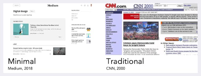
Now, everyone knows a ‘bad-looking’ website when they see it. For example, look at CNN in 2000. The reason we think this is bad isn’t necessarily because it’s old, but rather, because the composition is a mess and the content is hard to read without getting distracted.
Simple design doesn’t have to be dull, but it should prioritize one thing as the focal point of the page. Instagram is another good example of this. The primary purpose is to view the images, and everything else is stripped away. Need some inspiration? HubSpot put together a list of 32 inspiring website designs.
So just remember: Focus on getting the key things right – color, imagery, typography, and composition – and your designs will hit the mark with your audience.
Want to learn how to create a brand style guide? Check out the next article in the series.
Related
- Categories:
- Articles
- Web Design, CRO and UX
Upgrade to Power Membership to continue
your access to thousands of articles, toolkits, podcasts, lessons and much much more.
Become a Power Member
- Login
- View Courses
- - - -
- Courses
- Resources
- - - -
- My Account
- Change Password
- Logout