Aug 31, 2018
UX Writing for eCommerce Sites: A Practical Guide
If you were asked to summarize the most important elements of a website, what would you say? Good graphics? Strong video? Crisp and slick design, or nice fonts? Actually, something more significant than all the above (although important), is the copy on your website.
Some of the ugliest websites with high engagement have no ‘slick’ design or images, they just have well-crafted words.
This article introduces the science and art of user experience (UX) writing. It also provides practical examples and a summary of best practice to apply straight to your eCommerce platform today.
The Importance of UX Writing
The way we communicate on the web is so important to get right. From critical headlines to microcopy, the customer’s buying journey should be smooth. UX writing can be defined as the “act of writing copy for user-facing touchpoints” (Kristina Bjoran, Senior UX Designer at ForumOne).
Here are a couple of examples of why good UX writing is so vital:
- A third of all online shoppers will abandon a purchase because they can’t find the right information.
- 65% of website visitors will not submit a form if too much personal information is required (Expedia increased earnings by $12 million just by dropping one field from their form).
From this, we can see that people often have a negative experience when unnecessary hurdles are put in front of them. To address this, UX writing focuses on the experience of the customer. This writing role often gets confused with that of copywriter, technical writer or content strategist, but it is quite distinct in its own right.
What is the Purpose?
Words are often the most human part of the entire interaction with your eCommerce platform. Choosing the right language is key for removing complex hurdles for the customer. The words we write are key for the customer to:
- Be aware of their context on the webpage
- Understand the information or details provided
- Have the confidence to know what the next step is and how to do it
If you choose the wrong words, without research, then the customer’s experience will be poor. Bad information leads to the customer not learning from the facts and details provided. Neither will it motivate the customer to act, instead they will miss the opportunity to complete their task. Communication is so important.
Even if a design is fantastic, if the customer can’t understand the information then the product is immediately flawed. Adding extra content to the page doesn’t always fix the problem either, as this can lead to cognitive load and the user simply giving up and leaving. In communicating, it’s critical to give the right words, at the right time.
How Can You Understand Your Customers?
Before jumping into the design or writing up your first draft, it is important to first zoom into the end-user of the product. Ask questions about your customers, their background and their journey.
Here are some important questions to ask in your quest to understand your customers:
What do they know?
What do they want?
What are their pain points?
What do they need?
Where are they?
What device are they using?
What are their expectations?
How did they get here?
What were they doing before?
What can they do next?
When you have a firm understanding of your user, then consider the core task they want to complete for each part of the product they’re on. For example, for the product page of an eCommerce website, ask yourself: ‘What are the main things my customer wants to do at this stage, and how can I cater for that?’ After this, match your content primarily to meet their needs.
Here’s a quick example. Let’s say your product is new and your research indicates that potential customers are wary, disloyal to the brand and unsure whether your website is legitimate. The challenge is to craft content that meets those needs. How do you effectively instill trust and confidence when the customer browses your products? Below are some practical examples along with best practice which should answer that question.
Best Practices for UX Writing
Make Your Content Scannable and Readable
Line height and spacing are typographical concepts that can be implemented to make for excellent reading. There are a number of rules of thumb, but in short there should be a consistent and healthy gap between the lines and paragraphs.
To help people read your pages, research shows that there should be no more than 10 words per line of copy. Research has also gone into explaining how people interact with pages, which suggests that people don’t read, they scan.
It’s important to highlight your text with headings and clear structure (this includes sub-headings, bullets and introductions) so the customer can let their brain scan with ease. A common reading pattern or ‘route’ a customer takes, known as the ‘F pattern’, shows the importance of content hierarchy.
On a side note, there are analyzer tools available which critique the wording of your headlines. Research also shows that headlines should be six words long to have the most impact.
Remove Illegible Content Which Has a Terrible Impact on UX
Don’t rely solely on imagery to communicate. Icons, emojis and pictures are often scattered on a page, however they are no solid substitute for words. Some browsers, especially on mobile, struggle to load heavy images, and content is no good if it doesn’t load. A strong color contrast is also important, which makes for good reading and understanding of content.
Keep Your Audience in Mind to Avoid Language Barriers or Confusion
Ensure that the terminology used is appropriate to the context of the audience. For example, showing VAT/sales tax prices on a DIY website might confuse a non-trade customer. Think about the likely usage of the customer: Do they require detailed information when considering a product? If not, provide simple bullet points which make it easier for the customer to consume.
Ensure that the descriptions are well suited for the audience rather than just keeping the SEO team happy. At the end of the day, the Google search engine won’t be buying your product – customers will. Therefore, ensure that the description is appropriate for the user. In one project, insights showed that describing a power drill with simple bullet points was appropriate for the trade audience.
Always Think Before You Write
Often on websites, you can see the lack of thought that has gone into the project. On a single page you can see 30+ ‘Learn More’ or ‘See More’ buttons. However, that is not good enough for the user. Instead of this, be descriptive in your links.
For example, you could change ‘Read More’ to ‘Be the first to know about this’. To keep the user engaged, strive for informative messaging rather than bland instructions.
Be Wary of Language Barriers
Ensure your website has the capability of multilingual support, especially when it comes to calls to action (CTAs) and pricing.
For example, consider that a button which says ‘Add Friend’ translates to ‘Freund Hinzufügen’ in German. So make sure your buttons can cope with words that long. Do not just rely on Google Translate as it isn’t always accurate. Keep in mind the different cultures of your audience. For example, humor doesn’t always carry across to another culture. Use emojis with caution.
Consider using common language also. When referring to next day delivery, you could use the word ‘Tomorrow’ rather than a specific date. People are used to common words like this, rather than dates!
Remember that Shortcuts Don’t Always Work
According to digital copywriter and journalist Patrick Stafford, when UX copy is too short, “it gives you exactly the information you need and nothing else. Where’s the room for tone? For a little sparkle? For delighting the user? We can’t let our UX copy be boring.”
While the importance of brevity in writing is often emphasized, short copy can confuse and frustrate your customers in some cases. The best balance to achieve is to be concise, efficient and clear, while also providing sufficient information. Don’t be lazy by limiting your words, as that can negatively impact the UX.
Push the Right Buttons
CTAs are immensely important for your eCommerce website. By doing your homework on the customer, you can learn how to provide the best buttons that prompt the customer to keep going.
Improve Forms for Better Conversions
Providing clear explanations of what a page is about and what actions to take is crucial. For example, Google did some excellent research in improving the engagement rate of the microcopy of their hotel form. The end result was a 17% increase in engagement.
Remove Concerns and Always Explain
Your aim here is to help the user feel comfortable with what’s happening. You can add a layer of reassurance to key elements of the journey, for example the product page or the checkout. Meeting the customer needs is key.
MailChimp famously have their mascot, Freddie, take the pressure off the user just before they send out a mail campaign. The language and graphics work well together and provide reassurance. It’s very effective and an example of understanding the mindset of the customer and meeting their needs.
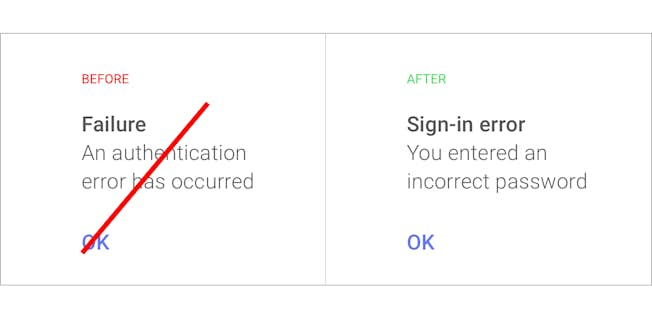
Don’t Leave Copy Up to the Developers
When things go wrong, ensure you have provided copy for the developers to implement. System error messages by default are made by computers, for computers. But we’re designing the web for our customers, therefore instead of ‘System error (code #2234): An authentication error has occurred’, you could write something like ‘Oops, you typed the wrong password. Please try again.’
Final Thoughts
Hopefully this article has given you a better understanding of the importance of writing for the web and providing better experiences for your customers.
With these best practices, practical tips and examples in mind, it’s now your task to ensure you are serving content to your customers that helps them navigate through your site and purchase products confidently.
Related

Upgrade to Power Membership to continue
your access to thousands of articles, toolkits, podcasts, lessons and much much more.
Become a Power Member
- Login
- View Courses
- - - -
- Courses
- Resources
- - - -
- My Account
- Change Password
- Logout