No matter what type of product you sell, every e-commerce merchant has one key goal: sell more of it.
Conversions are the most important metric for any e-commerce business. By increasing your conversion rate, your business will generate more revenue, earn a larger profit at the end of every month, and expand its audience of customers.
The great thing about e-commerce conversion optimization is that small changes often have significant results. A day spent reviewing and updating your website’s category structure, for example, can produce a lasting increase in conversions that drives a huge amount of revenue.
Below, we’ve listed seven e-commerce conversion optimization tactics that can transform your online store from an average performer into a leader in its category. If your goal is to sell more from your website, read on and implement these seven proven, data-supported strategies.
Optimize your home page
Aside from people that find your website by searching for specific products, the majority of users will arrive on your website’s home page first.
Most e-commerce home pages are wasted real estate -- an intermediary page that users quickly skip over to search for specific products and categories. By adding top-selling products, special offers and hot categories to your homepage, you can turn it into a valuable marketing asset.
This encourages your users to follow a specific path through your website, giving you a greater degree of control over their experience. Here’s a great example of an e-commerce website with a clear path for new users to follow, courtesy of Amazon:

As soon as a new, unregistered user arrives on Amazon.com, they’re prompted to login to their account. There’s even a “New to Amazon?” link for users that have yet to register an account on the website.
To the right, there’s a list of Amazon’s most popular departments, a top-selling dress shop and a daily special offer. Every section of Amazon’s home page is optimized to lead users to a specific pathway, letting Amazon design their own experience as shoppers.
If your ecommerce website’s homepage doesn’t lead users down a specific path, you miss out on a valuable opportunity to design their experience and optimize your revenue per user.
One of the simplest ways to design a profitable path from your homepage is to promote a best selling product. If you have a product that appeals to a broad audience of customers, it could be an ideal offer to place on your homepage.
A/B testing software Visual Website Optimizer has a great guide to optimization for e-commerce home pages. If you’re new to e-commerce, it’s a good place to start when designing your home page.
If you have a special offer or sale, adding it to your homepage is a great way to drive traffic to an appealing section of your website. T-shirt retailer Threadless does this by featuring new designs on its homepage every week, driving traffic to its newest product pages:

Your e-commerce website’s home page doesn’t need to be perfect, but it does need to tell users to do something. With your key conversion goal in mind, design your home page so that there’s a specific pathway for users to follow, not just a “filler” intermediary page.
Simplify your product categories
Study data from usability, customer experience and statistics company Measuring U shows that only 11 to 21% of ecommerce website visitors start their shopping experience by searching - a relatively small amount.
This means that up to 89% of your website’s visitors will find the products they want by browsing your website rather than searching. Without simple, logical product categories, it’s often difficult for these users to find what they’re looking for.
Data from the Baymard Institute shows that browsers and searchers typically have very different motivations as consumers:
People who search e-commerce websites typically already know what they’re looking for (for example, a specific model of TV) or need to narrow down the range of products in a very large online store, such as Amazon.com or Walmart.com.
People who use category browsing typically aren’t yet aware of the specific product they want to purchase. There’s also a clear bias towards category browsing in markets where the look of a product (for example, clothing or decor) plays a role in its appeal.
If you operate in a market such as apparel, where the look of a product is particularly important, it’s vital that your website’s product categories are laid out using a logical, sensible manner that makes browsing your website easy.
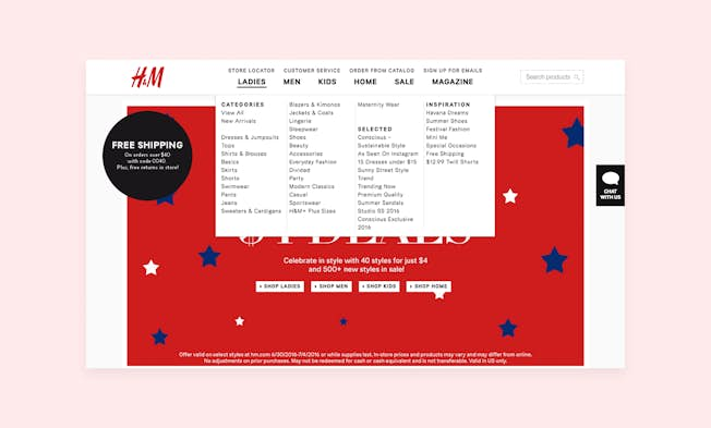
Here’s an example of clear, logical product categorization, courtesy of H&M:

As soon as a visitor arrives on H&M.com, they can navigate to a specific category. A search bar is available, but since few of H&M’s customers search for specific product, it’s not a key part of the website’s design.
Some users will search for specific products on your website, but most won’t. Make it as easy as possible for users to find the product categories they’re interested in from your home page and you’ll reduce your bounce rate and increase conversions.
Offer a variety of ways to buy
While most customers will check out of your store online using a credit card, some will prefer to use a completely different payment and order method.
“Offering a variety of ways to buy from your e-commerce website is an easy way to add an extra 10-20% to your total order volume.”
This is particularly true if you target an older, less technically minded audience that isn’t very familiar with online commerce.
Instead of only offering payment via credit card, offer a variety of online payment options. If your customers are primarily in North America or Europe, adding PayPal to your payment options is a simple way to expand your prospective customer audience.
If you target a specific region with its own payment gateways, offering these is a simple way to widen your local customer base.
If your store is local or regional, you can also let customers order by phone, fax or email. When customers are located close to your retail store or shipping outlet, you can even provide in-store pickup and payment to expand the range of options available for your customers.
It costs very little to offer alternative payment and pickup methods, giving your business little to lose and a huge amount to gain by increasing the number of ways customers can shop using your online store.
Improve each product's copy
Just like great copy can double or triple the conversion rate of a landing page, excellent copy is often all it takes to significantly increase the average conversion rate of your product pages.
From digital goods to physical products, any type of product can benefit from engaging, helpful copy. If your e-commerce website uses merchant-provided copy and/or product descriptions, a quick switch to more personalized, effective copy could be all it takes to improve conversions.
After you’ve optimized your home page and product categorization system, make product pages your priority. Work with a professional copywriter to write descriptions that:
- Focus on benefits instead of just product features
- Use the key benefits and selling points listed in customer reviews
- Emphasize why your store is specifically worth buying from
- Make your return and refund policy clear and obvious
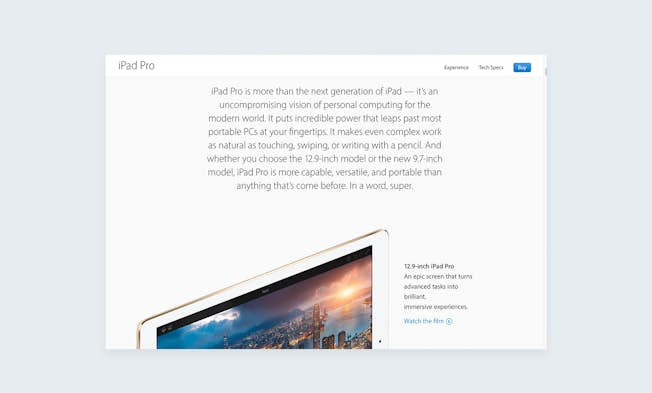
With the right copy, you'll paint a powerful visual image for customers of what your product can do and why it's worth buying. For an example of what great copy can do, read this description of the iPad Pro from Apple's website:

See how it’s all about the benefits of the product, and not only its features? While most product descriptions are strictly business, Apple goes into detail about how the iPad Pro improves your life, and why it’s worth investing in.
Freckle more than doubled its conversion rate by rewriting its copy. Many other businesses have done likewise. Instead of only focusing on design and user experience, make copywriting a priority of your conversion rate optimization efforts and you’ll notice real, measurable results.
Use video to your advantage
Customers love product videos, since they capture the feel, function and look of a product in a way that images alone can’t. If you sell a product that’s all about the experience, adding a demo video to its description page is a fantastic way to improve your conversion rate.
Videos remove a lot of the uncertainties that users can have about specific products. A video is capable of showing the size and scale of a product in a way that images can’t, or displaying the feel of a product in a way that can’t be explained in text.
Survey data shows that most e-commerce companies that use product videos report a positive effect on conversion rate.
- To get the most out of product videos, it’s important to focus on the aspects of a specific product that customers are most likely to care about:
- If the product has a specific function, show it operating so that users can visualize it in their home or office.
- Show the product in and out of its packaging, so that users get an idea of what to expect if they buy it.
- Address the key concerns of customers, such as design, usability, or durability, in each product video.
Product videos are also valuable marketing assets. By posting your product videos on YouTube and linking back to your website, you could generate traffic when people search for product names, model numbers and review videos.
Give buyers all the information they need
Nothing hurts a conversion rate quite like uncertainty. When prospective customers aren’t sure what they will get, or have doubts about a product’s quality or value, very few of them will opt to check out and become paying customers.
One of the easiest ways to improve your e-commerce website’s conversion rate is to give your customers all the information they need before they check out.
To ease uncertainties about delivery time, show customers exactly how long it will take for each product to arrive before they reach the checkout page. Show a clear price for each item on the product page, without any hidden fees or last-minute shipping charges.
When an item is out of stock, make it clear by mentioning this on the product page. If it will be back in stock in the future, let prospective customers opt in to receive an email notification the moment it’s available again.
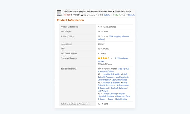
Specify the item’s weight and dimensions so that customers can visualize the box arriving in the mail and the item sitting in their living room. Give as much precise information as possible, even if it seems trivial or unimportant. Customers rarely object to being given precise details.
Here’s an example of good product information, from Amazon.com, for an inexpensive kitchen scale:

Although few customers care about the weight of a small kitchen scale, some do. By providing as much information as possible about each product, you lower uncertainty and give customers fewer reasons not to buy something.
Simplify your checkout process
“On average, 68.63% of customers abandon their shopping carts before completing a purchase, often never to return.”
Cart abandonment is a normal part of e-commerce and something that every online retailer has to deal with. While it’s impossible to eliminate cart abandonment entirely, simplifying the process of checking out from your e-commerce store can help you lower your cart abandonment rate.
Checking out should never be difficult, but many e-commerce websites make the process more complicated than it needs to be. Simplify your checkout process by implementing the following recommendations:
- Use a persistent shopping cart, which lets users return to your e-commerce website to check out without having to re-add their items.
- If users register for your website before checking out, retain their information and pre-fill it into your checkout form automatically.
- Give examples for every form field, particularly addresses and other fields where users often make mistakes.
- Don’t require customers to register in order to check out.
Even with careful optimization, it’s impossible to completely eliminate cart abandonment on your e-commerce website. However, the four techniques above can help you significantly reduce the number of customers that abandon their orders, improving your average conversion rate.
What are your e-commerce website's weaknesses?
Every e-commerce website has weaknesses, from poor product copy to a confusing navigation system. Using the seven strategies listed above, make fixing your website’s weaknesses a top priority and you’ll notice a significant, measurable increase in sales!
Related
- Categories:
- Articles
- E-Commerce
Upgrade to Power Membership to continue
your access to thousands of articles, toolkits, podcasts, lessons and much much more.
Become a Power Member- Login
- View Courses
- - - -
- Courses
- Resources
- - - -
- My Account
- Change Password
- Logout


