
Study Notes
Download pdf 1 MB
More Free Lessons in
Get cutting-edge digital marketing skills, know-how and strategy
This micro lesson is from one of our globally recognized digital marketing courses.
Start a FREE Course Preview12 years delivering excellence
Join a global community
Globally recognised
Toolkits, content & more
So once they’re through to the checkout, again, this is probably, alongside the home page, is one of the most important areas to look at on your website from a conversion rate optimization point of view. Because everyone who buys from your site goes through these pages, and it’s the time where they are most likely to drop out because you’re asking them to part with their hard-earned money.
There are different formats and layouts that you can use for these checkouts and we’re going to talk through three of them here.
The first is the multi-step checkout.
So almost all checkouts will require you to fill in four key bits of information or go through four key stages:
On a multi-stage checkout, all four of those bits happen on individual web pages that typically have a progress bar along the top so that they can show you how you’re progressing through those stages.
The benefits of this style of checkout are that it doesn’t show a huge amount of information on one individual page so it can be less overwhelming for someone when they first come onto it. The downsides are that it requires several different pages to load, and that can take longer to go through the process and make it more likely that someone will drop out partway through the process.
This takes the four stages of the checkout, merges them into one page, and has all of that information there in front of the shopper when they come onto the page.
So again, the benefits of this are that it’s quicker as it’s one step to go through, but the downsides are that it can be quite daunting and lots of information for the person to fill out when they first land on the page, which will put some people off.
So the third option is kind of a hybrid between these two approaches, and it’s called an accordion style. And this is where you get each stage of the checkout as the primary bit of information that you can see and that you’re asked to fill in on the checkout, and then once you’ve filled that information in, you then click on the next one down. The one you’ve been on shrinks, and the one that you’ve just entered into expands, and that’s where you fill in the next stage of the detail.
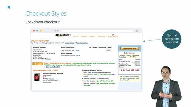
Another interesting example of a checkout is Amazon’s page. Amazon in general have, because people are typically logged into their account while they’re checking out, lots of information about that person on file, which means that they can streamline the checkout process because they already know the person’s delivery address or they have a range of options available. Likewise, they already know the delivery address and the billing information, so can they can put a short list of options available to the customer and they just need to pick which one they’re looking for, and then they can simply click on it without filling in their information.
The other key thing to note is that Amazon have done what a lot of businesses do and what they call lock-down this checkout, which basically means they’ve made it much more difficult to navigate away from the checkout back to the rest of the website. So on almost every other page, on Amazon’s website, the Amazon logo would be clickable to return to the home page. However, it’s not on the checkout. Likewise, almost every other page would have a footer at the bottom and a header at the top that allow them to easily navigate around the rest of the site. Both of those things are removed from this checkout page with the sole aim of keeping people’s focus on what’s most important to Amazon of getting them through that final stage of checkout and completing their purchase.
So by removing all the other noise and all the other potential distractions that might make people go back to the main page, and potentially make it less likely that they’ll come back and complete their purchase in the end.
Tracking codes and pixels enable analytics and advanced advertising and they can also aid re-marketing efforts. So effectively, when you’re thinking of structuring your site, a big part of what you need to do is all the things we’ve already discussed about what pages you have, how they’re put together, and how you help people search through your site.
But you also need to make sure that you’re capturing the relevant data so that you actually know how people are traveling through your site and you actually know where they’re leaving from on your site and generally how they’re behaving. And one of the most popular tools for doing this is Google Analytics.
Effectively, how Google Analytics works is you have small amounts of JavaScript on each of your pages that take information from the browser that the user’s using and sends that off to Analytics where it’s all captured and can be reviewed later.
Because Google Analytics is so widely used, it’s reasonably easy to set up and there’s lots of blogs and online resources available for how to do this. But generally, if you’re using any of the kind of out-of-the-box, web-hosted, web design tools like Shopify, they’ll have lots of advice on how you set up Google Analytics correctly. And any good web designer would also be very clued up on how to implement this. And so often, it’s as simple as inserting your URL into the Google Analytics user interface, putting a few bits of relevant code onto your website, and then that starts the process of capturing all the information of how people are using your site that you can then analyze to help optimize your site.
Back to TopGraeme Smeaton is the founder of Royal & Awesome. Along with a proven track record in defining and delivering marketing strategies that drive significant growth and create real shareholder value, Graeme is highly commercial. He has extensive experience managing PLs and other key financial statements, while being an operational board director of AFG Media Ltd, and has experience negotiating with suppliers, distributors and licensing partners.

Data protection regulations affect almost all aspects of digital marketing. Therefore, DMI has produced a short course on GDPR for all of our students. If you wish to learn more about GDPR, you can do so here:
The following pieces of content from the Digital Marketing Institute's Membership Library have been chosen to offer additional material that you might find interesting or insightful.
You can find more information and content like this on the Digital Marketing Institute's Membership Library
You will not be assessed on this content in your final exam.
ABOUT THIS DIGITAL MARKETING MODULE
 Graeme Smeaton
The Applied E-Commerce module will introduce the key concepts of effective e-commerce and will teach you how analytics allows for refinement of the model. You will become familiar with the elements of a successful e-commerce website and the process of traffic generation. The module will also introduce you to various sales tactics, including channel selling. Finally, you will recognize how the e-commerce Customer Relationship Management (CRM) systems can help you maximize user experiences.
Ready to learn more about E-Commerce?
Sign up for a FREE trial, and get access to more great content to help you level up your digital marketing career.