Aug 4, 2022
Digital Accessibility For Marketers Part 3: Email, Social Content & SEO
A marketer’s job is more than just maintaining a user-friendly website. Marketing professionals also use various strategies and channels to acquire website traffic. It doesn’t matter if you have the most amazing site on the planet—if no one visits it, you may as well have one of those circa 1997 Angelfire sites (remember them?) for all that it matters.
This series of three articles is intended to introduce you to some foundational practices you can start implementing immediately to help make your digital content more accessible.
Our previous post on Digital Accessibility for User Experience & Websites dug into website marketing features and techniques; this post will go over external channels and mediums as well as how to test them, starting with email. You can also have a look at the first of this three-part series for an overview of accessbility issues.
Accessible email
Email marketing is one of the most critical tools in a marketer’s toolkit. Companies use email for transactional (think, order confirmations) and promotional purposes, as well as for customer support. You’d be hard-pressed to find a digitally-savvy company today that doesn’t take advantage of its many benefits.
Yet though virtually all organizations use email to communicate with customers, clients, and prospects, not all of them ensure the emails they send out are accessible.
HTML versus plain-text emails
If your company sends out plain text emails, chances are they’re accessible. If your link text is not descriptive (see the previous post for more information on this) it may be slightly harder for an individual with a disability to get the gist of the message, it’s not an impossible barrier.
The problem is, most marketers love HTML emails. And what’s not to love? You can style them to match your brand, fill them with glorious images and eye-catching GIFs, and create a more attractive email than what you’d be able to achieve with a vanilla plain-text email. In addition, now that third-party cookies are becoming a thing of the past, email is fast seeing a resurgence as a big digital marketing trend.
That’s not the issue here. The issue is that when you start embellishing your emails and you don’t take accessibility into account, some users may not be able get a comprehensive understanding (or worst case, not be able to understand any of it).
HTML emails are similar to webpages in the sense that they use header and image tags and styling to render in an email platform. Plain-text emails are just that: plain text. In order for HTML emails to be accessible, you need to follow the same guidelines as you would for websites.
The problem with table-based layouts
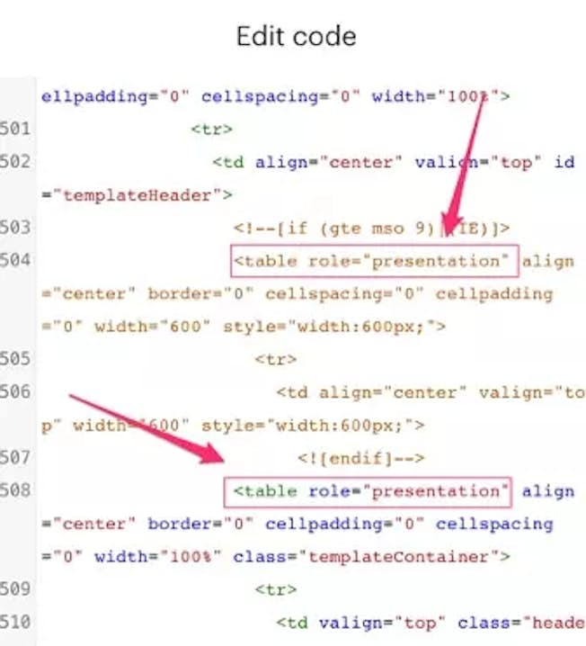
Most HTML emails are structured using table tags because they offered the most consistent look for emails viewed in multiple email clients. But the table tag was not actually intended to be used in this way; like many other web-design techniques, web designers hijacked them for their own purposes. This poses a problem for screen reader users, however, as a screen reader will still read the content inside tables as individual cells, making for a disjointed user experience.
However, you can circumvent that by adding a small snippet of code to your HTML. Simply add role=“presentation” to alert these users that these are presentation tables, not a data table.

The presentation role hides the table structure from screen readers while leaving the content inside the table unaffected. To a screen reader user, it will appear as if there were no table to begin with.
Don’t be stingy with your tags
Just because you’re creating an email doesn’t mean rules for orderly code go out the window. Ensure your headers are used correctly (e.g., use the H1 for the title, H2/H3 for sub-headers, etc.) so everyone, regardless of their visual abilities, will be able to get the gist of your content in a logical reading order. Take advantage of title tags here too, to provide additional context.
Alternative text matters here too!
If your email client requires a user to click to download images, you may have experienced the following: You open an email with lots of blank squares and only bits of text to explain what’s going on. As soon as you click “Download images” and the visuals appear, the puzzle pieces fall into place, but until that moment, you’re utterly confused.
Unfortunately, this will be a daily (or hourly) experience for screen reader users if the marketers neglect to include alt text for the visuals. So do them a favor and include it for email images. For decorative images, use the empty alt attribute.
Mobile accessibility best practices
As people are increasingly reading their emails on their mobile devices, it has become more critical to design with this consideration in mind. Conveniently, guidelines for a better mobile experience coincide with accessibility. For example:
- Aim to keep your text above 14px font – if people can’t read your message on mobile, they won’t read it at all
- Keep your color contrast to accepted guidelines, which makes it easier for people with all visual abilities to consume your content
- Avoid center-aligned paragraphs (much harder to read, especially on a small device)
- Make link text informative and short
An inclusive multimedia experience
Multimedia like videos and podcasts are great assets for marketers to help increase brand awareness, generate product interest, and connect with their target audience. The good news is that a) it’s pretty easy to make content like this accessible, and b) when you make it accessible, it can improve the experience for everyone.
Accessible videos
A visually impaired person will not be able to fully see what’s happening on the screen, whereas someone with hearing challenges won’t be able to hear the dialogue. You can add captions to accommodate deaf viewers or those with poor hearing. YouTube will automatically generate captions, but they’re not the best quality—it’s usually better to splurge on a captioning service if it’s a long video or manually correct the auto-generated captions if it’s short. One nice benefit of captioning is that it can help people who can see perfectly. Have you ever been in a waiting room or an airport and wished you could hear what people on a muted TV were saying? Or maybe a friend posts a video on social media you’re dying to watch, but you’re in a public place without headphones. Captioning solves both these problems and makes the content accessible to people with visual disabilities.
Visually impaired people will be able to hear the dialogue but may miss out on key areas of a video if there is no narration for instances where no one is talking. That’s where audio descriptions come in handy. Audio descriptions are a narration of what is happening on screen. Check the video below for an example:
Video not playing? View it at YouTube.
When Netflix launched audio descriptions they were such a hit they decided to test out an audio-only mode that would allow users to save on data usage while bingeing on the go.
Transcripts for audio content
Transcripts are very helpful for people with all kinds of disabilities. Screen reader users and those with hearing difficulties can zip through them without having to go through the entire video (a feature people without disabilities can take advantage of this as well!).
Some assets are entirely audio-based. A podcast, for example, would be entirely useless to someone who was unable to hear it; a transcript makes it accessible. The DMI provides transcripts for every podcast, like this episode on Making Live Theater Work Online.
The easiest way to add a transcript to your site is as a downloadable text file and if you also display the text on the page that will help your SEO efforts
PDFs (Portable Document Formats)
Inclusivity isn’t the only reason you should ensure your PDF is accessible; it’s also beneficial for SEO. If a screen reader can read it, a web crawler can crawl it, sending valuable signals back to Google about your website content.
Some software is better equipped to convert documents to accessible PDFs than others. Microsoft has been particularly mindful of accessibility, whereas other companies have deprioritized it, and it shows in the level of effort required to create accessible PDFs.
Microsoft programs
Microsoft Word has a Create PDF option under its Acrobat menu header; this will automatically convert your file into an accessible PDF. You can use the same option for converting PowerPoint presentations into PDFs. (Note that you should always add alt text to images before converting your file to a PDF.) Use the native Accessibility Checker (located under the Review menu item) before transforming your files into PDFs.
Using Adobe Acrobat to create accessible PDFs
Converting other file formats to accessible PDFs require a little more effort. For example, design files (like those created on Adobe software) will necessitate some manipulation before and after you’ve transformed the file into a PDF.
Adobe Acrobat Pro has a native accessibility checker function that will help surface some errors, but the work needed to complete the process using the Acrobat Accessibility features can be challenging and is best left to the pros.
Testing PDFs for accessibility
It’s wise to test PDF accessibility with a screen reader or using a tool like JAWS Inspect. Regardless of what a native accessibility checker will tell you about a PDF, exposing your file to a real user or proxy is the best way to confirm its accessibility.
SO (search engine optimization) and accessibility
What’s good for SEO is also good for accessibility. Screen readers are similar to web crawlers: both can only read content on a site that is made available to them. That means inaccessible PDFs, images without alt text, multimedia without a transcript, etc., are all effectively invisible. They’ll only be able to read the file name. Your website could be missing out on some amazing opportunities to rank simply because of its inaccessible elements.
There are other SEO best practices that converge with accessibility guidelines, such as using proper and sequential heading structures and descriptive link text. For more information on this topic, check out our blog post on how SEO helps with accessibility and vice versa.
Testing your marketing materials for accessibility
Testing for accessibility is as critical as your efforts to make your assets accessible in the first place. While it’s admirable to aim for accessibility, until you’ve verified that your content is actually accessible, you’ve only fought half the battle.
Furthermore, testing and documenting your results will be advantageous for your company if you ever become the target of a lawsuit and help you identify trends to stop accessibility issues at the source.
You can check out the TGPi website for full details of their testing tools.
Related
Upgrade to Power Membership to continue
your access to thousands of articles, toolkits, podcasts, lessons and much much more.
Become a Power Member- Login
- View Courses
- - - -
- Courses
- Resources
- - - -
- My Account
- Change Password
- Logout


