Have you ever clicked on a webpage from a Google search result and immediately hit the back button?
Online, first impressions matter. A lot. It's the point of no return–either your visitors want to stick around on your website and perhaps become a customer, or they want to leave.
Just like we judge or form an opinion about a person in a matter one or two minutes, we do the same online but often in only a few seconds.
Here's how Usability Hub describes the five-second test:
“Five-second testing is a form of usability testing that allows you to measure how well a design quickly communicates a message. This kind of test provides both quantitative and qualitative feedback that helps you optimize a design.”
In this test, a person is shown a static image of a webpage or mobile app for five seconds and then asked to recall key pieces of information, like whether they noticed what action an app developer wants them to take next or what's the purpose of a webpage.
The test works well for designers getting feedback before their creations go out into the wild.
But what if you already have a live webpage. What can you do to pass a real-life five-second usability test, where your visitors want to carry on reading and not hit the back button?
1: Does the Page Have a Strong Informational Scent?
Raluca Budiu is a user experience consultant for Nielsen Norman Group and provides an interesting theory to how people navigate on the web:
To decide whether to visit a page, people take into account how much relevant information they are likely to find on that page relative to the effort involved in extracting that info.
Raluca compares animal-foraging to information-foraging, and this impacts whether someone will stay on your site or quickly hop over to a competitor's website.

When people visit your site, they are foraging for information. Often, they have a question, and they decide very quickly how likely your website can answer their problem and how much time and effort is required to extract that information.
So, your job is to quickly convince visitors to your website that you can answer their problems, and you do this by laying down a strong informational ‘scent’.
Here are some ways you can create an informational scent:
- Put yourself in your customer's shoes to understand what questions need answering before they are ready to buy.
- Make your content easy to scan (see checkpoint #2) and using headings as signposts to the questions your answer.
- Build up an increasingly strong informational scent by addressing common problems with detailed solutions.
2: Is Your Writing Succinct?
“ People read 25% slower onscreen, and they skim rather than read. Web text should be short, scannable, and structured as linked, topical pages.” Usability expert Jakob Nielsen
Short Text
Because people read slower online, Jakob recommends that you should write 50% less text when compared to a hardcopy publication.
Are you succinct in your writing? Are you providing the essential information that offers a strong informational scent towards the products and services you offer?
Scannability
Your content needs to be easy to scan. People scan text first and only read properly if the informational scent is strong enough.
One common way people scan is in this F-shaped pattern:
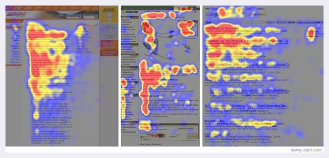
Eye-tracking software shows that many people start by viewing the left of a webpage and then scanning to the right. After that, they drop down the page and again scan from left to right, before completing an F-shaped scan by viewing down the page. This is referring to a desktop user; viewers on a mobile device tend to scan in a different pattern, which is focussed more on the upper two-thirds of an optimized webpage.
You can make your content scannable by:
- Outlining content with clear headings and subheadings.
- Include meaningful images that are relevant to the page's content.
- Emphasizing important words and sentences through bolding and bullet points.
3: Is the Page Easy to Use on a Mobile Device?
Since 2016, more people use mobile and tablet devices to browse the web than desktop computers.
As a minimum, your webpages should pass Google's Mobile-Friendly Test.
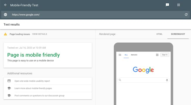
The test covers the basics of how easy a webpage is to view on a mobile device. For example, it will flag whether the text is too small, touch elements are too close or if the viewports are incorrect.
If your pages aren't mobile-friendly, there's a chance Google won't index or rank them at all.
To increase your mobile usability further, Google recommends:
- Keep calls to action (CTAs) front and center.
- Keep menus short and sweet.
- Make it easy to get back to the homepage.
- Don't let (pop-up) promotions steal the show.
- Make site search visible.
4: Does Your Webpage Load Quickly?
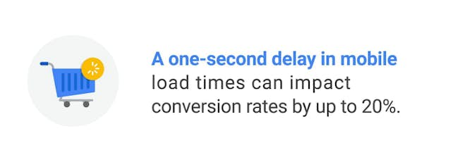
According to Google, even a one-second delay in mobile load times can impact conversions by 20%. If you think about it, that is one second less to make a great first impression in the five-second test.
In fact, Google has been obsessed with page speed for a long time. While a really slow website can seriously affect your SEO and usability progress, a top page speed score would only give you a slight ranking boost.
That's expected to change in 2021 when Google starts using Page Experience as a ranking factor, and in amping up the importance of page speed in its algorithms.
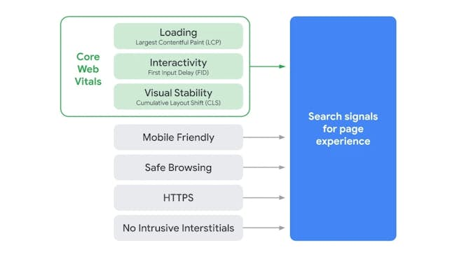
Page Experience is made up of several smaller signals that include core web vitals, mobile-friendliness, safe-browsing, HTTPs, and no intrusive interstitials (pop-ups).
Many SEOs believe that Google will pay particularly close attention to the core web vitals metrics. These include page speed metrics such as the loading and interactivity times, as well as how visually stable a webpage is.
You can run your website through Google's Page Speed Insights Tool to see how your site fares for Largest Contentful Paint, First Input Delay, and Cumulative Layout Shift, which are the three metrics that make up Google’s core web vitals.
Improving these metrics is quite technical, so it may involve a helping hand from your web developer but here are three things that can help:
- Break up long JavaScript tasks into smaller tasks.
- Upgrade your web hosting to improve server response times.
- Avoid adding dynamic content above the fold of a webpage.
5: Is Your Content Trustworthy?
It may not be possible to tell if a webpage is trustworthy after only a few seconds of viewing it, but that's doesn't mean people won't try and make estimations.
Take Digital Marketing Institute's homepage, for example:
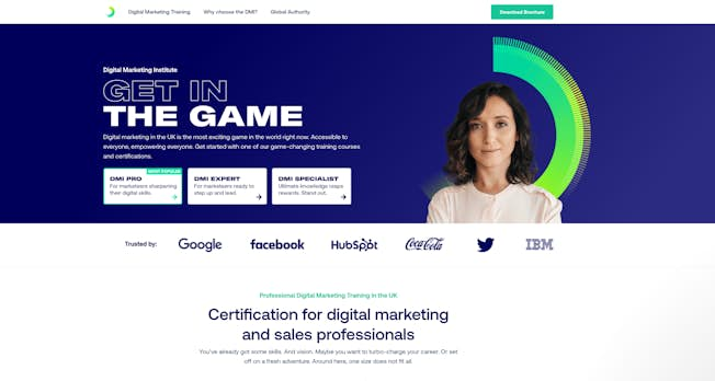
It looks modern, professional and well designed. It has good use of images, colours and text that helps it quickly convey trust and confidence.
Here are three steps you can take to ensure your webpages are trustworthy:
- Compare one of your most important pages to the competition - how do the designs and visuals compare? What can you improve?
- Does the page include social-proof that it's credible? This could be reviews, case studies, awards won or simply your business credentials.
- Are all your webpages on HTTPs? If not, Google Chrome will flag the page as "not secure", and visitors will trust the content less.
Okay, now that we've covered five checkpoints to encourage your visitors to stick around and not hit the back button - do you have a favorite? Or, does one stick out that perhaps you need to work on more?
Some are easier to fix like making your content more succinct and scannable, and others are more technical, like speeding up your website which may need help from a web developer.
Either way, remember that the first few seconds that a visitor lands on your website are precious. Your webpages need to make a great first impression by laying down a strong informational scent, load quickly, look good on mobile devices, while the content is sufficient and trustworthy.
Related
Upgrade to Power Membership to continue
your access to thousands of articles, toolkits, podcasts, lessons and much much more.
Become a Power Member- Login
- View Courses
- - - -
- Courses
- Resources
- - - -
- My Account
- Change Password
- Logout


