Jul 23, 2018
Learning from the Online Retail Giants: Amazon and eBay
With over 310 million customers, Amazon is the retailer to learn from, and with over 170 million customers, eBay is a strong second. These websites serve almost every imaginable customer, niche and preference in the world, and they’ve created purchase processes that make online shopping easier than ever.
Amazon has definitely been a pioneer for many of these practices. In this case study, we’ll look into the homepage, product filtering, product pages, buying process and emails that Amazon and eBay use to drive their growth.
Before we go into details, here are some elements of a successful conversion process to give you an idea of industry best practices:
- Reduced choices: Product filters that help reduce the overwhelm of too many options
- Simple checkout page: Only asking for key information in the checkout process and avoiding too many pages while doing so
- Selling the actual product: Product pages that feature the benefits of the product through images, descriptions, reviews and questions answered
- Simple layout: Ensuring the site is easy to navigate and makes the search for the perfect product straightforward
- Security: Ensuring the purchase process is safe by displaying payment options and certificates
So let’s dive straight into the two websites.
Homepage for the Logged-out Visitor
When you land on the homepage of these two eCommerce giants for the first time, before registering an account or logging into an existing one, you can see some common patterns:
- A non-intrusive navigation bar
- Ongoing deals, which Amazon calls ‘Today’s Deals’ and eBay calls ‘Daily Deals’
- Seasonal promotions, such as Father’s Day deals and summer must-haves
- The benefits of free shipping
Here are both screenshots for comparison:

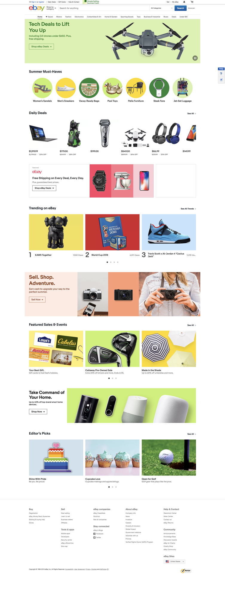
As you may notice, neither of the homepages has just one call to action or a main goal to drive next actions on the page. This is quite expected for an online shop with such broad category offerings – they are simply looking to ‘catch’ the visitor with a broad appeal and hopefully encourage them to click deeper into related and similar products.
Amazon seems to have picked up the location of the browser, so there is a message at the top left corner that promotes delivery to the country in question. There doesn’t seem to be such activity from eBay.
One thing that stands out with Amazon here is that the login option is more prominently displayed compared to eBay. There is a dropdown sign-in button at the top, but not just that: at the bottom of the homepage, there is a ‘Sign in to see personalized recommendations’ button. On eBay, the login option is quite hidden and blended it at the top left corner.
The next test was to check how these homepages change and adapt based on the logged-out behavior. More specifically, would the layout and the suggested products shift towards categories that were viewed even though no user was logged in?
Not surprisingly, Amazon’s homepage changed significantly based on viewing just six products, all of which fell into the categories of: women’s watch, coconut oil, and tea tree oil.

Almost none of the original suggestions from the homepage were now visible, but more than half of the personalized homepage still consisted of bestsellers, free shipping promotions and summer products.
However, it was interesting to see that eBay’s homepage remained the same no matter how many products and categories were viewed. There were no changes to the layout or listed products regardless of the product-browsing sessions.
Homepage for the Logged-in Visitor
What happens with the homepages once the customer registers and logs into their account?
Amazon took the simplest path possible and focused on just a few core offers: their Prime, Audible and Kindle Unlimited subscriptions, along with the books, movies, shows and apps that are part of them.
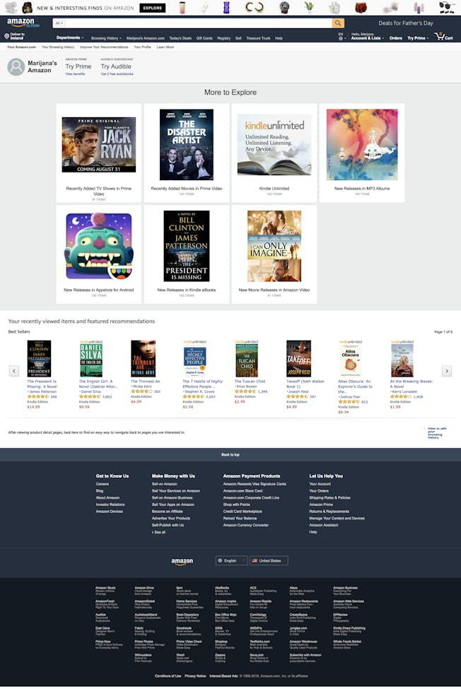
This feels like a stripped-down approach that emphasizes what Amazon originally became known for – books. Even though you can still access all the categories and search for other products, they aren’t making it an obvious next action when you first log in.
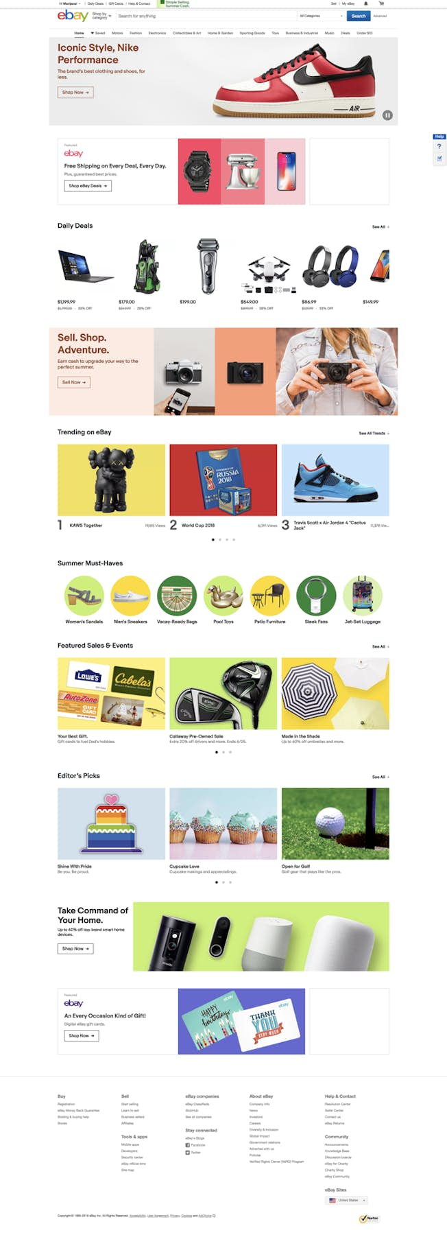
On the other hand, eBay doesn’t change much once you log in. There seems to be a higher preference for daily deals and free shipping compared to the logged-out version, and seasonal products are moved below the fold. The experience and available options don’t feel any different:
Both sites start customizing your homepage minutes after you’ve started viewing products. To test what this looks like, I viewed a few products from a couple of different categories.
On Amazon, the homepage started looking a lot like the personalized homepage before logging in: it started showing products I viewed beforehand! Above these sections, however, it started showing books I’ve viewed, recommendations for similar books, and a promotion for Amazon Prime I can use with these books.
Meanwhile, eBay has a slightly different approach. They add the recently viewed items in the order of viewing at the very top (Amazon does it at the bottom). Then, it starts listing categories I’ve viewed, in this case travel luggage and voice assistants, as well as recommended sellers in these categories.
The key difference to note here is the variety of goals these customized, logged-in homepages have, even though they are both driven by customer behavior. Amazon pushes a free trial for their paid subscription based on the products viewed, and eBay shows the trust their sellers have earned.
Product Search and Filtering
We mentioned earlier how simplified, reduced choices can help with quickly selecting a product and avoiding overwhelm of too many options. This comparison aimed to look into the execution of category selection and other search filters while searching for a certain type of product – in this case, a travel coffee mug.
The main difference here comes from the layout and number of items on the results page: Amazon displays 26 products in a grid, while eBay shows 50 products in a list on a single page.
When it comes to filters, it is quite interesting to see that both sites have an exhaustive list of filtering options, from delivery options, size, colors, price ranges, brands, and much more – eBay allows for 11 filtering options, and Amazon has a whopping 21 filters.
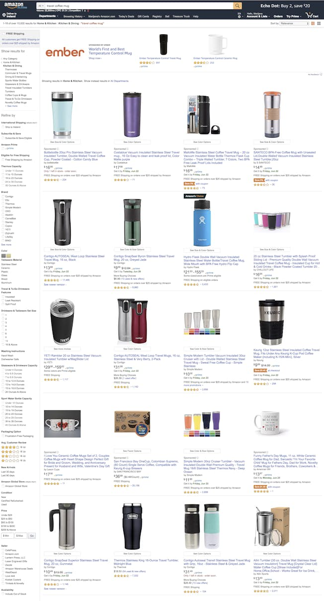
While this would be quite counterintuitive for a shop of a couple of dozens or a few hundred items, here’s why it makes sense for Amazon and eBay. These giants displayed over 10,000 results just for this one search, and advanced filtering is crucial. While it may feel counterintuitive because of potential overwhelm, these filters actually act as quite the opposite—they reduce overwhelm by narrowing product options.
Product Pages: Layout, Images, Copy and Reviews
To analyze the makeup of product pages, let’s look at the same product on both sites.
When you first look at the product, you’ll notice there’s a large image on the left-hand side and the name, price, and average rating on the right-hand side:
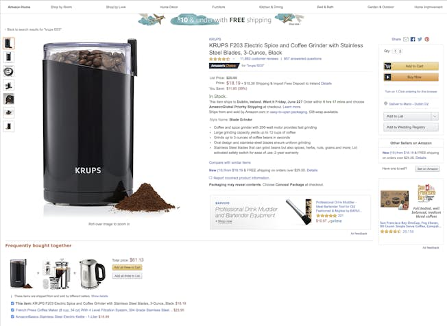
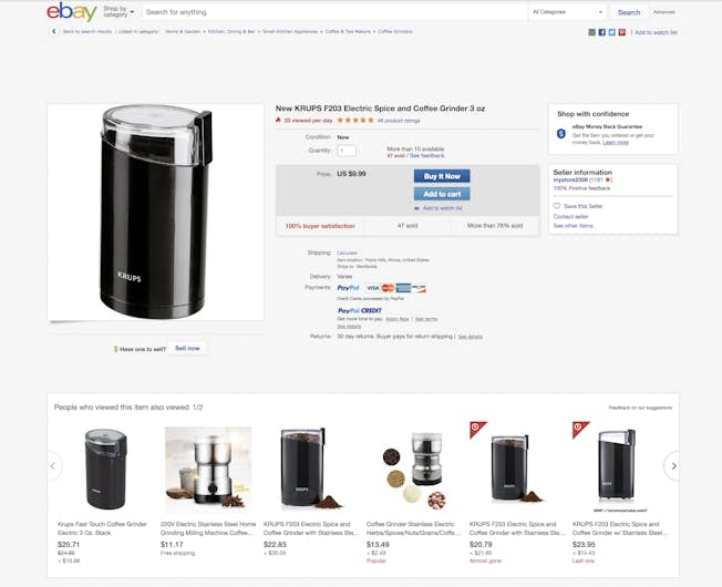
This section also features the stock information and delivery details. However, Amazon’s listing goes into a lot more detail at the top. There is a bullet-point list of this grinder’s main features, while eBay doesn’t go into descriptions and details until you go below the fold.
Apart from this, here are some other product page differences you might notice:
- Below the product image, Amazon suggests a combination of three products you can add to cart immediately; eBay doesn’t have a similar feature.
- eBay features the ‘People who viewed this item also viewed’ section below the product image; Amazon does this at the bottom of the page.
- Amazon’s page offers an in-depth matrix with comparisons to similar products, as well as a detailed spec sheet from the manufacturer; eBay only has a short section with product information from the seller.
- Amazon features customer questions and answers about the product; eBay doesn’t.
- Amazon displays around 15 customer reviews with a ‘See all’ button below, while Ebay only shows five.
- eBay shows payment options (PayPal, credit cards) at the top of the listing; Amazon doesn’t display this.
As an overall product page conclusion, all the key differences stem from the fact that Amazon’s product pages seem to be about double the length of eBay’s product pages, which allows for additional personalizations and psychology-driven recommendations.
Conversion Process: Buttons and Checkout
As you may have noticed, both Amazon and eBay offer two ways of proceeding with a purchase: ‘Add to cart’ and ‘Buy now’.
The key difference between these is that the first option encourages the customer to keep shopping by keeping you in the same interface and offering related products, while the second option makes you jump directly to the furthest part of the checkout process (based on the information previously entered) and removes all navigation.
Here’s how it looks in practice.
On Amazon, when you select ‘Add to cart’, you’ll see sponsored, related, and ‘also shopped for’ products and still see the navigation bar:
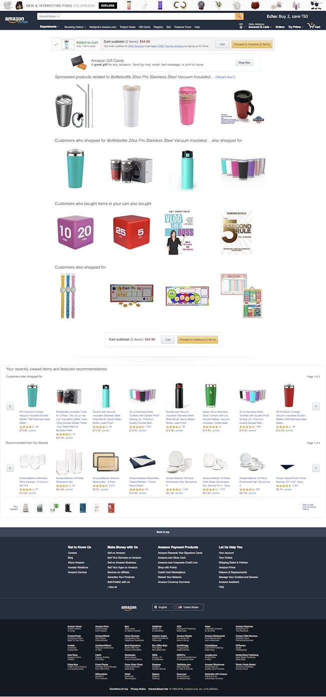
You can also click ‘Proceed to checkout’, which will take you to the standard Amazon checkout process.
On eBay, when you select ‘Add to cart’, you’ll see a pop-up box that confirms your action and suggests ‘frequently bought together’ items, as well as how much you should spend to get a discount:
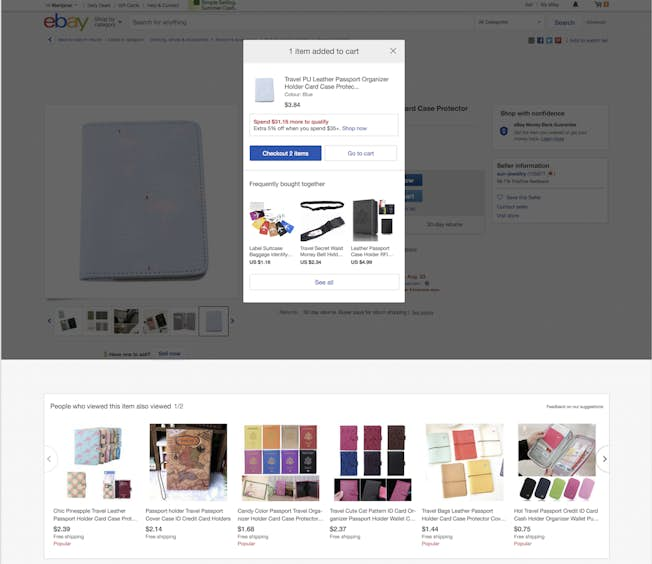
Just like Amazon, you can choose to check out from here and follow the standard process.
The ‘Buy now’ button is where the true eCommerce magic comes in.
We mentioned earlier how crucial it is to have a simplified, streamlined checkout process to make sure your customer doesn’t give up because of complicated purchase requirements. This is what Amazon mastered many years ago when they implemented their one-click checkout.
In late 2017, their patent on this process expired, and online retailers are now free to leverage this quick and easy way for their customers to check out quickly.
As noted earlier, this direct ‘Buy now’ feature strips the interface of all the navigation, links, or essentially anything that doesn’t contribute to the fast checkout:
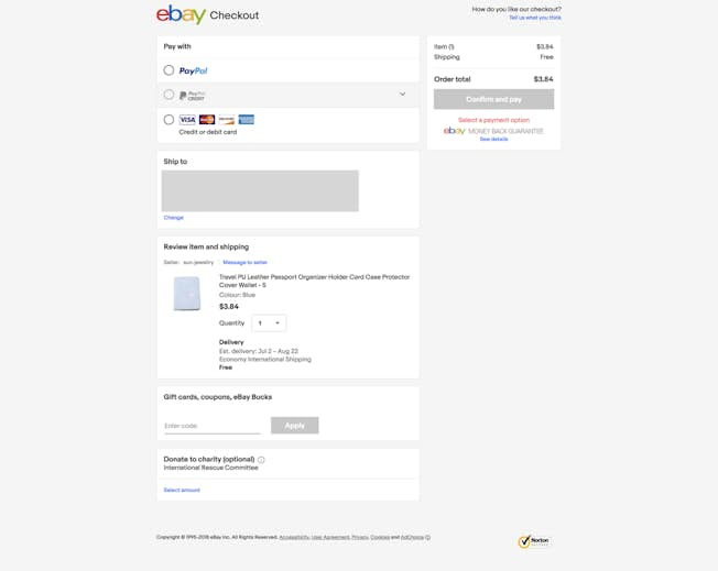
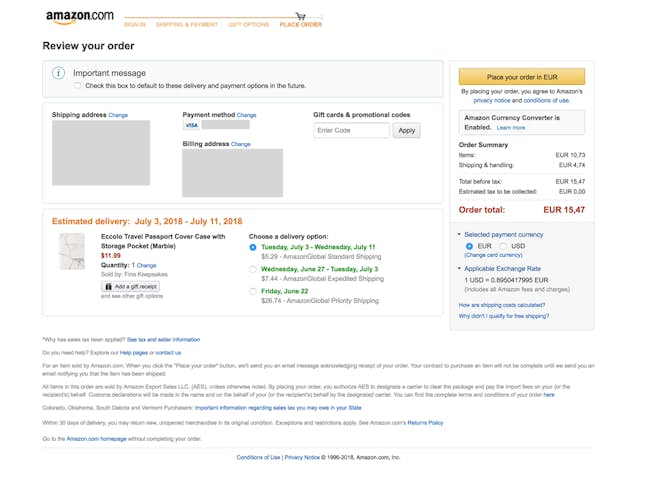
The only information this process asks for is the one it explicitly needs in order to let the customer finish the purchase. For example, in case there wasn’t an address or a payment method entered in the account, there will be a prompt for this. Likewise, if there is more than one address or payment method entered, the system will ask the customer to choose.
In both scenarios, the only call to action is ‘Continue’ after the selection is made, and the final checkout screen follows.
Emails
One last important area to look into is the emails these online retailers send to their logged-in customers to encourage them to complete a purchase or suggest a hyper-relevant product based on their browsing or past shopping.
These emails seem to fall into two categories: cart abandonment emails and product recommendations.
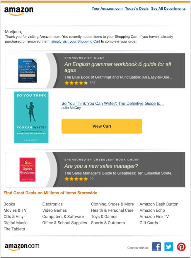
Cart abandonment emails aim to recover the revenue a retailer would have otherwise lost because their customer added products to their cart – and then left. With almost 70% carts abandoned, these emails can result in significant revenue recovery from a simple activity like tracking these customer activities.
Here’s how Amazon does it:
Here’s an example from eBay:
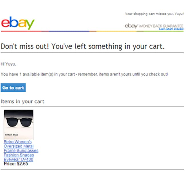
Emails from these two retailers follow a template and don’t seem to vary in content apart from the actual products listed. Oftentimes, however, you’ll find that an offer like free shipping or a discount works great with other retailers who have leveraged this cart abandonment strategy.
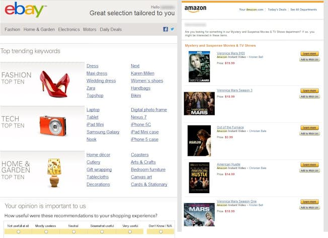
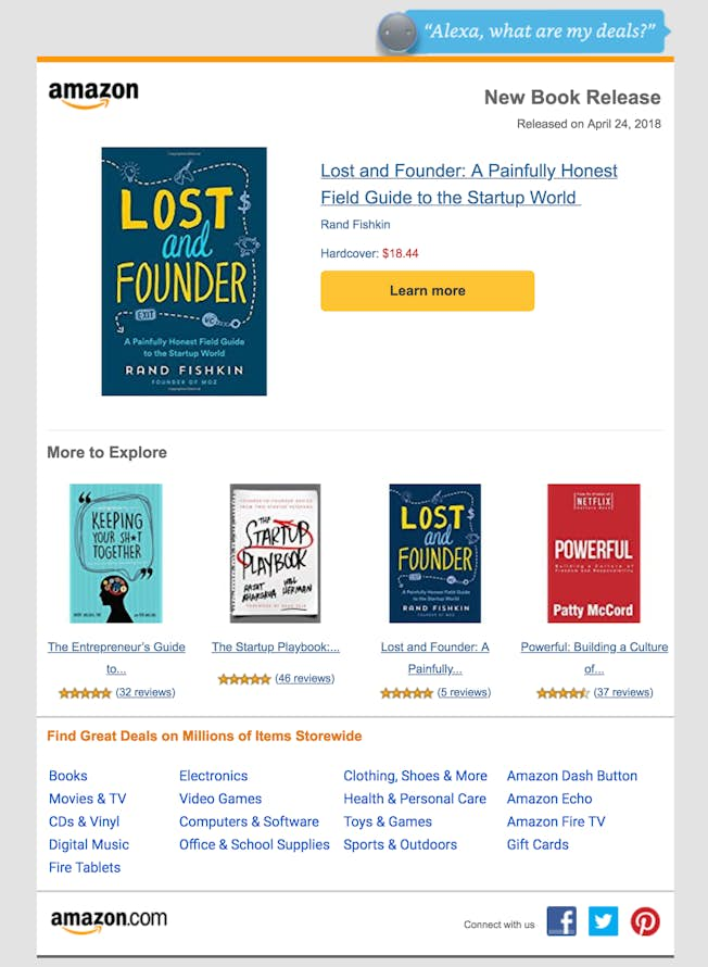
The second type of email, with product recommendations, can entail a few different strategies, from recommending products similar to those purchased before through to announcing deals on those products and celebrating new releases.
Here is an example from both retailers:
Here is another one from Amazon when a new book was released:
The Key Lessons from the World’s Largest Online Retailers
Earlier we covered what it takes to ensure a streamlined and resilient conversion process from a user experience and personalization point of view.
As you’ve seen, Amazon and eBay are leaders in this area for a reason: they listen to their customers and give them what they want. They make sure product pages have all the necessary information, even though they do it in a slightly different way when it comes to layout. They ensure it’s easy to find every product, even when it means filters have to be advanced and seemingly overwhelming. They include safety in their transactions very well, and more than anything, they make checking out easy.
Every eCommerce owner can learn to implement these best practices on their own scale and in a way that makes sense for their industry, customers, and logistics.
Finally, customers have never had more power over their buying process than they do now, so listening to them is paramount, and it’s a sure way to winning them over for a long-term success.
Upgrade to Power Membership to continue
your access to thousands of articles, toolkits, podcasts, lessons and much much more.
Become a Power Member- Login
- View Courses
- - - -
- Courses
- Resources
- - - -
- My Account
- Change Password
- Logout


