If you imagine your online space as a large shop, you can see customers coming in and having a browse. When somebody leaves without buying, you don’t panic because that’s the nature of browsing. You know you can rearrange the floor or put up more signs to try to entice them to buy.
Now, imagine the checkout area. There are five customers, each with a number of products in their basket. Some are spending a lot, some only a little. But it’s all income and each person represents a potential repeat customer.
From your seat above the store, you watch four people dump their baskets and leave right before they get to the checkout. Alarmed? You should be.
In March 2020 alone, 88.05% of shopping carts were abandoned worldwide. And, what’s more, the current global mobile cart abandonment rate stands at 85.65%. That’s huge.
So, how can your business stop people from throwing their products back?
Know What You Can Convert
We all know that 100% conversion would be fantastic. But we also know that it’s never going to happen. So, where should you set your sights? What is a good conversion rate?
According to Khalid Saleh of InvespCro, it is important to understand the types of conversion and, crucially, whether you could convert the visit into a sale in the first place.
“It varies. What’s great for one industry might be below par for another.
“One multi-billion dollar company I once worked with had conversion rates of 41% for first time visitors. And they still wanted more.
“The key is to understand the average e-commerce conversion rate and benchmark your performance against it. Once you know whether you are meeting the average for your industry, you can work to improve conversion rates until you’re in the top 10 percentile of performers.”
He adds:
“Think about your own website and consider the type of browsing vs. buying of your average consumer. If you know that visitors tend to use your website for research but do not convert online, what can you do to convert more visitors into buyers?”
It is important then, to know what a good conversion rate for your business is and aim to get there.
Study your analytics before you do anything. Where is your conversion rate? What do you want to do? Think about conversion as a measure of success for your business, but it is not an arbitrary number. Do you want to double your online sales? Then double your conversion rate.
For your reference, here are some important variables that could affect your cart abandonment rates:
- The product or service type.
- The product / service cost or average order value.
- The traffic source.
- The device (mobile, tablet or PC).
- The platform (Windows, Mac, iOS or Android, for example).
- The browsing location.
Why should you be getting this right? 2020 eCommerce sales are projected to be around $3.914 trillion, for a start.
Get Your Funnels Right
To start understanding what we can turn into sales, it is important to know why people abandon baskets in the first place.
According to Kissmetrics, these reasons range from shipping to research.
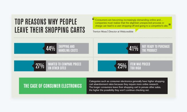
While you may not always have a chance to ask customers why they are leaving – and exit surveys aren’t always a good idea – you can consult research to understand why.
Simple changes to how your site is presented can stop people leaving their carts. One obvious one is to show the final price that the customer pays when the product gets added to the cart. People don’t like being surprised by massive price additions like shipping and handling.
If you present the price early, customers will be more prepared to spend that money.
Conversely, you can turn this into an opportunity.
Offering free shipping to people who sign up as members or giving rewards points that can be redeemed against shipping costs can make customers more loyal, drive email signups and be a pleasant user experience.
Think about these barriers and what you can do to break them down.
This logic is key to getting your funnels right.
Basically put, a funnel is a process that any visitor takes from seeing your product to buying it. This could come from Facebook ads, organic search or inbound marketing.
A guiding principle in this area is: keep the process as simple as possible. Amazon is an e-commerce behemoth and is known for one-click ordering. Once a customer is signed in, they can enable their account to accept orders at the drop of a finger.
Why then, does your site ask for their mother’s maiden name when they want to buy a t-shirt?
55% of shoppers (potential paying customers) will abandon their cart for having to re-enter their credit card or payment details alone.
If you take measures to streamline your checkout process, removing any unnecessary elements of the journey that cause friction, you stand to reduce your card abandonment rates significantly. In fact, checkout optimization can boost conversions by 35.62%.
Examine the steps your customers have to go through to buy your product from all angles and ask yourself: would I go to the hassle of shopping here?
Companies Who Are Winning – And Why
When you think of where you spend money online, you will probably find that they have good funnels in common.
Here are some who are doing it right:
Netflix
The entertainment giant’s login screen is simple. It focuses on risk reversal and simplicity and has a clear call to action.
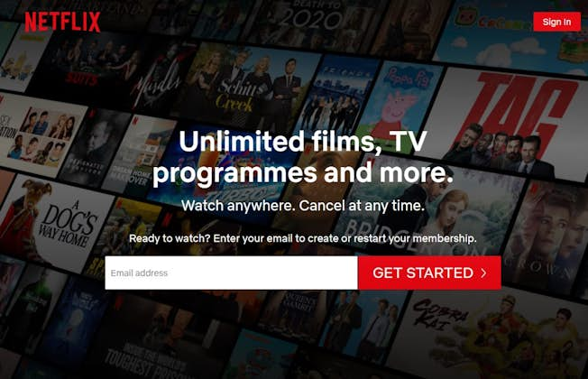
The entertainment giant’s login screen is simple. It focuses on risk reversal and simplicity and has a clear call to action.
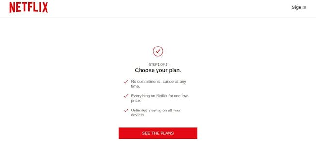
Again, the free trial is emphasized, the call to action is clear, and the USPs are outlined clearly as well as concisely. No unnecessary information is added. The page is completely digestible, even at a glance.
The plans page automatically highlights the premium package. This choice architecture is clever because it knows that most people will assume that the pre-picked choice is best, even if it is the most expensive. And again, the USPs and value are easy to see at a glance.
The customer is then asked for an email address and password – the first time they are asked to do more than click.
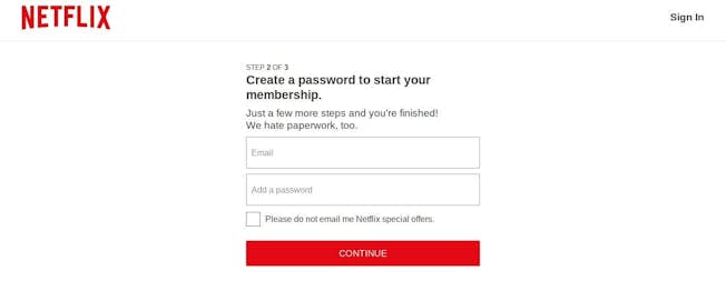
The free trial signup page, the final step, is simple, completely streamlined, and offers the choice of opting out of any marketing communications, which helps to buil trust. Note how little Netflix asks its potential customers to do. Since 2010, it has grown users from fewer than 20 million to 192 million. No small feat in anyone’s marketing playbook.
Crazy Egg
Website optimization site Crazy Egg has doubled its conversions and revenue every year and this funnel is a big part of it. It is another example of simplicity as beauty.
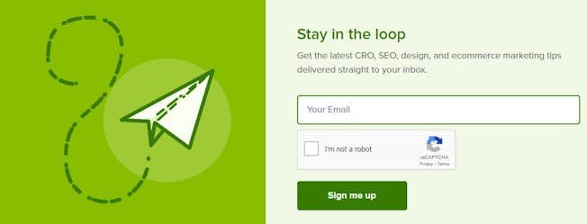
CrazyEgg originates traffic from referrals, blog content, and promotions. At the base of its blog entries you’ll find an option to sign up for the newsletter and ‘stay in the loop.’. And, in the top right hand corner, there’s a clearcut CTA button asking visitors to ‘start their free 30-day trial.’
By clicking the ‘free trial’ CTA button, you’re immediately navigated to a page that is clear, concise, and visually balanced. Like Netflix, you can sign up swiftly with a simple email and password and to inspire trust, a well-placed testimonial is located on the right-hand side of the page. Fast, streamlined, and completely frictionless.
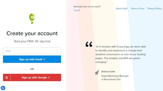
By clicking the ‘free trial’ CTA button, you’re immediately navigated to a page that is clear, concise, and visually balanced. Like Netflix, you can sign up swiftly with a simple email and password and to inspire trust, a well-placed testimonial is located on the right-hand side of the page. Fast, streamlined, and completely frictionless.
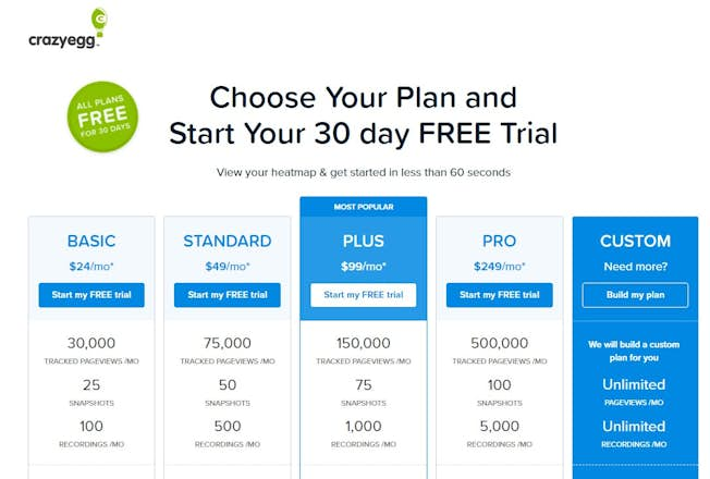
Accessing the free trial sign-up page (another one of CrazyEgg’s main consumer conversion routes or journeys), you will see that the premium or ‘Plus’ option is also highlighted to increase potential subscription value while formatting the features or USPs for quick page scanning. A design built to optimize the checkout process and reduce the chances or cart abandonment.
Take these examples and look at how you can implement them on your own funnel.
- Can you remove anything and make the process more visual?
- Can you nudge customers to make higher-value purchases?
- Can you make the experience the same as gliding through an empty checkout at a physical store?
Carry out an audit of your user journeys and watch your abandonment rates decline.
(First published June 2018, updated January 2021)
Related
- Categories:
- Articles
- E-Commerce
- Web Design, CRO and UX
Upgrade to Power Membership to continue
your access to thousands of articles, toolkits, podcasts, lessons and much much more.
Become a Power Member- Login
- View Courses
- - - -
- Courses
- Resources
- - - -
- My Account
- Change Password
- Logout


