Aug 12, 2019
The Essential Guide to Optimizing Your Emails for Mobile
55% of email is now opened on a mobile device, a statistic which confirms that more email is read on mobile than on desktop. As desktop opens steadily decline, being able to execute marketing campaigns that display and operate effectively on mobile devices is an essential skill. Any marketer’s overall objectives will include increasing engagement and customer acquisition. The key? Mobile-friendly email marketing.
Pay attention to your pre-header text
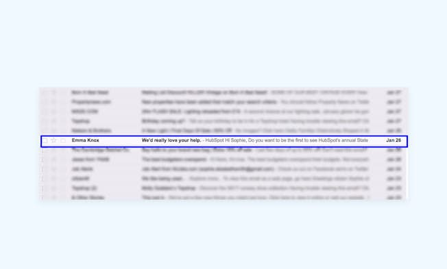
When it comes to email marketing best practice, the focus is often firmly placed on subject lines – how to keep them short and succinct (yet compelling and informative) and why you should split test to see what best engages your audience. Pre-header text, meanwhile, is often overlooked though it is equally important! Also known as a 'Johnson Box', it refers to the first line of your email text that is visible as a preview in a user’s email client. It is an invaluable companion to the subject line and provides precious extra characters that you can use to incentivize your recipients to click.
Because pre-header text length varies based on the email client and device being used, it’s important to keep it short, punchy and easy to consume. In the same way that you can split test subject lines, you can also split test pre-header text, and tailor it to different target audience segments, their preferences, and the email clients and devices they’re using. Your Email Service Provider’s native analytics platform will provide you with this data.
There are a number of approaches you can take to optimize the impact of your pre-header text. One is to make your subject line and pre-header text one connected message. This means that you have more space to put your messaging into context or it can include a deeper level of detail such as price points and percentage discounts.
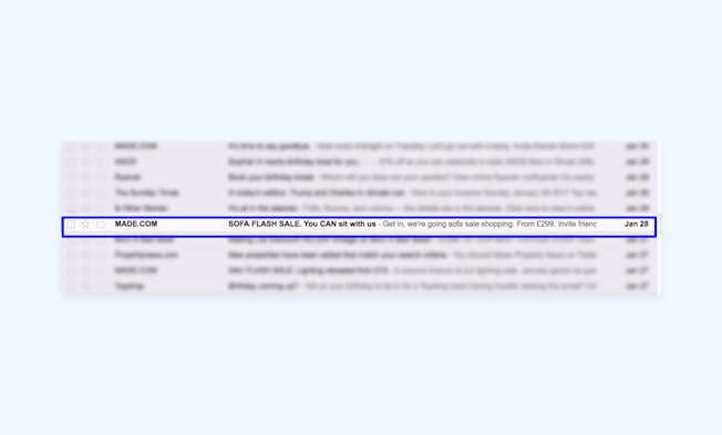
Personalization is critical to the success of email marketing – marketers are encouraged to implement it within their copy, and sometimes within their subject lines to increase conversion. But what about pre-header text? Tailor your pre-header message to add a more personal touch and you might stand a better chance of improving your Click-Throughs.
Make the most of buttons
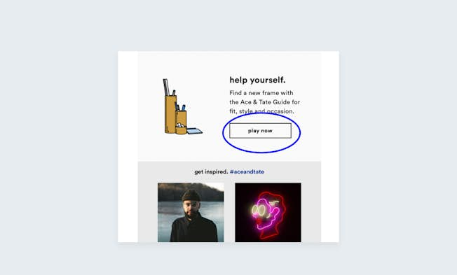
Most marketers are aware of the concept of employing concise, incentivizing Calls-To-Action. In mobile-friendly marketing emails, it’s best to bring CTAs as far up within the copy as possible, and to limit the amount of copy used, as text-heavy emails don’t perform particularly well on mobile. It’s also recommended to use buttons instead of links. This is largely due to the fact that hyperlinks, much like excessive amounts of text, don’t make the most of an email’s mobile-responsive design. Buttons are more distinctive and easier to click on when using a mobile device. Leaving a sufficient amount of white space around the button (where possible) will enhance mobile UX even further.
You can optimize your button CTAs by limiting the number of words used and ensuring that you utilize action verbs that serve as an additional encouragement to click. Phrases such as 'download now', 'find out more', 'shop the collection' or 'get exclusive access' lead users in the right direction by offering them information about where their follow-up action will take them, nurturing them along the path to purchase without being too dictatorial. Using words like 'today' and 'now' will help to create a sense of urgency by intimating that availability of your product or service is limited.
Utilize device detection
Since the rise of mobile adoption, effective email marketing has hinged on the use of mobile-responsive design. Email Service Providers such as MailChimp and Campaign Monitor offer users a selection of pre-designed, responsive templates that can be customized to suit your needs, as well as those of your target audience. Yet although mobile-responsive templates can look exceptionally good on mobile, they can still be hard to use. Device detection – when emails can detect and adapt to different devices – is a simple alternative to mobile-responsive design.
You can create emails that display different content depending on the device from which they’re accessed, be it an iPhone, Android, or tablet device. For example, if one of your digital marketing objectives is to increase online purchases, you can tailor an email that immediately displays button CTAs that allow a user to click through to a more streamlined, mobile-optimized product page and engage in a more simplified checkout process.
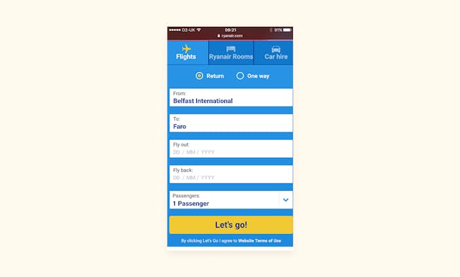
If your goal is to increase app downloads, you can adapt your email to direct users to either the Google Play store or Apple App Store based on whether they’re using an Android device or an iPhone.
If you can gain an insight into how customers are consuming your content, you can optimize their email experience and accommodate a multi-channel journey that will increase engagement and conversions.
Common sense dictates that the more succinct your marketing email is, the better it will perform, particularly on a mobile device. As well as shortened text and explicit, prominent button CTAs, the layout of your email can make a significant impact on your audience’s levels of engagement.
Emails should be between 600 and 800 pixels in width, as the majority of email clients don’t provide a preview-pane size that is particularly wide. The preview you create is arguably more important than your marketing email in its entirety because, much like your subject line and pre-header text, it can influence a user to engage with your email and click through.
There are two main types of layout types that can be used to optimize your mobile-friendly emails. Single-column layouts are best suited to predominantly text-based email as they support skim-reading, placing content exactly where the user expects it to be, and it can be scrolled through quickly. Single-column emails also allow for more pronounced headings, which makes your content more easily accessible.
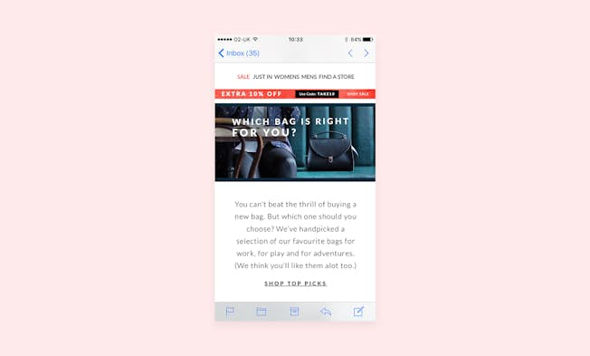
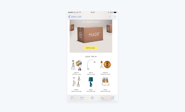
Multi-column emails, meanwhile, can make reading more difficult due to the need for horizontal scrolling, so they are not best suited to text-based emails. They are, however, great for emails with a variety of content, such as image-based content. This would work well in an ecommerce scenario, where a marketing email would be sent displaying images to accompany a variety of products targeted at the recipient.
Once you’re satisfied that you have sufficiently optimized your emails for mobile devices, you should measure their performance to determine whether there’s anything you can do to improve your approach. For everything you need to know, you can access our Practical Guide to Email Marketing Metrics here.
Related
- Categories:
- Articles
- Email Marketing
- Web Design, CRO and UX
Upgrade to Power Membership to continue
your access to thousands of articles, toolkits, podcasts, lessons and much much more.
Become a Power Member- Login
- View Courses
- - - -
- Courses
- Resources
- - - -
- My Account
- Change Password
- Logout


