It’s no secret that mobile traffic continues to soar. According to Statista, mobile accounts for 51.92% of all web traffic and mobile usage typically surpasses desktop use, affecting everything from shopping to communication behaviors. Despite this widespread use of mobile devices, some marketers have yet to optimize their websites, ads and images for mobile success. If your mobile optimization efforts are still lagging behind, here are three ways to ensure you’re ready to face a mobile-heavy marketing world.
1. Optimize Text
To create mobile-friendly content, you first need to understand how people read content on mobile devices. There are some key differences between desktop reading and mobile reading.
Reading Patterns
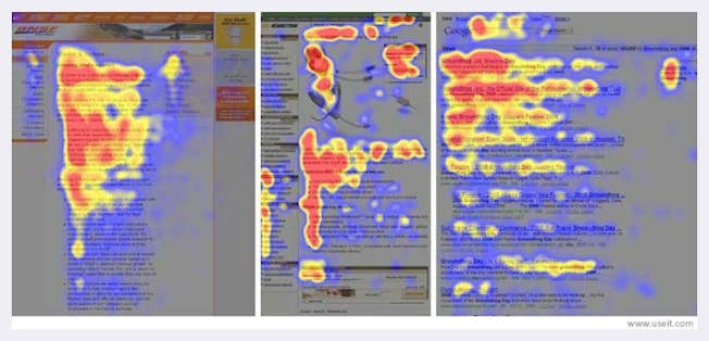
The following two viewing patterns have been generally accepted for desktop-based reading based on research trials:
1. The “golden triangle” is a viewing pattern in which viewers primarily look at the upper left corner of a search engine page or website. The principle resulted from eye-tracking studies in which the majority of rapid eye movement covers a triangular pattern.
2. The "F-shaped pattern" is a more popular reading pattern in which users look at the top, left to right, down, left to right again and then down further. It makes the shape of an ‘F’ in eye-tracking studies. This pattern does not apply to mobile readers because there’s not enough screen space to merit such sweeping vertical and horizontal movements.
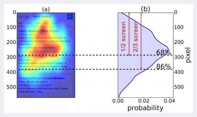
When it comes to a mobile screen, as the image below shows, users give 68% of their attention to the center and top half of a mobile site and a full 86 % to the upper two-thirds. Anything below this point on the screen is rarely viewed; however, it’s best practice to optimize all your content.
Mobile Copywriting Best Practices
To make sure that your content has the biggest impact possible, follow these steps:
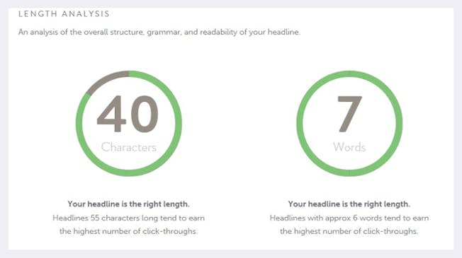
1. Headline: Your headline should be short so that it doesn’t take up the majority of the device’s screen. CoSchedule suggests that headlines with about 6 words get the highest amount of click-throughs. The Emotional Marketing Value Headline Analyzer also scores shorter headlines (up to 5 words) the highest. You can also test your title’s usability on a mobile device with CoSchedule’s headline analyzer. We used the analyzer on this blog’s headline with the following result:
Your mobile headline should also pique the user’s interest and give a clear indication of what to expect from your content.
2. Summary: Some marketers are big fans of including a summary at the top of their posts. Consider this a TLDR (“too long, didn’t read”) for the top of your content. You can also incorporate a summary-type style into your first paragraph by clearly outlining what the reader will learn from the piece.
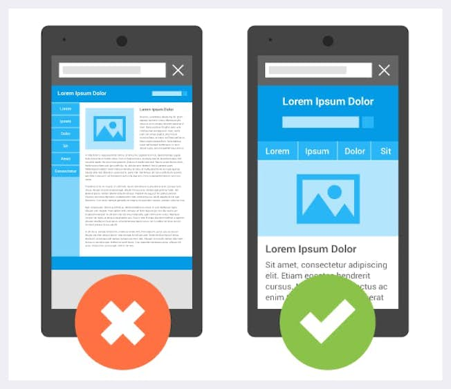
3. Body: Use “chunking” to make your mobile content easier to consume. Chunking is the practice of grouping related content into easily digestible “chunks,” or groups. Below is an example of what mobile sites look like, first without chunking (on the left) and with chunking (on the right).
Use the following to chunk your content:
- Images
- Styling (italics, bold)
- Subheaders
- White space
- Short paragraphs
- Summary
Use Shorter Words
Additionally, you may want to consider shorter, more precise words in your mobile content. The American Plain Language Action and Information Network has a list of some of the words you can simplify in all your content - and not just mobile - such as “some” instead of “a number of”, or “so” instead of “consequently”. Here’s a list of 50 of the most used wordy phrases and their simpler alternatives from Daily Writing Tips. The Hemingway app is a great tool for helping you simplify your content in these ways and more.
2. Optimize Images & Videos
As we’ve seen in the chunked content examples, images are a great way to make your content more ‘readable’ on mobile devices. Screenshot, graphics, memes and more, add a visual punch to your content that keeps users interested. But there’s a catch: your images must be optimized for mobile. Otherwise, they could take up too much real estate or become illegible.
Eye-Tracking Studies for Images
Studies show that mobile users look at images more than they look at text. (Note: KG stands for Knowledge Graph – the entity results, panels and carousel summary are provided by Google.)
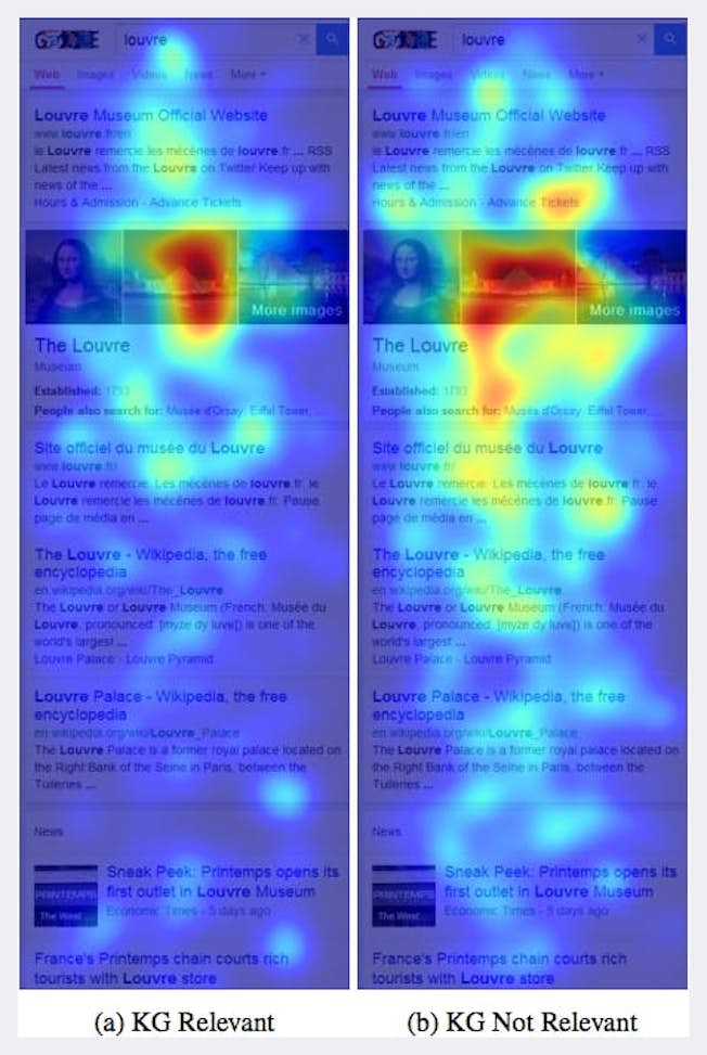
This image shows that a user’s eye is drawn to images over text. Intent, query, content, relevance, and location are irrelevant to the principle that the human eye is drawn to images. That can be good or bad. It’s good if your images add to your argument or make your point; it’s bad if they are simply distracting. To achieve the best results, offer your most valuable information directly after an image on both mobile and desktop devices.
Load Times & Images
Load times are one of the biggest deciding factors for users engaging with your content or bouncing back to the search results. You need users to see your content quickly, and slow load times are detrimental to this cause. Here are some tips for ensuring your images load speedily:
- Use Compression: Compression allows you to make your large files smaller without compromising appearance. Tools such as TinyJPG are ideal for ensuring this is done properly.
- Try Responsive Resizing Tools: We’ll talk more about site responsiveness later, but if responsive images are on your list, tools like embedlyDisplay can help.
- Create Pre-Optimized Images: There are many tools available that create pre-optimized images for emails, social media, websites and more. Try a tool like Canva to get started.
It may seem like an obvious idea, but you should always run your content (including images) through a preview process. Use your mobile device to check and see if you have enough white space to keep content readable. Try to imagine yourself as the end-user. Would you want to read and view most of the content and images on the page? Do the images have a clear purpose?
Optimizing Videos
Mobile video consumption rises by 100% each year. And, by 2022, online video content will account for around 82% of all web traffic. If you want to encourage mobile users to watch your videos, follow these two tips.
- Create Readable Text: First, make sure the text in your videos is readable on mobile devices. Then, make sure you have a transcript of the video for those that prefer to read versus watch. This will also help you increase the SEO value of your page. Many users play videos without the audio. In fact, 85% of video on Facebook is played without sound. Make sure your video makes sense without it.
- Optimize Your Tech: By embedding third-party video hosting services like YouTube or Vimeo on your site, you can ensure bitrates, compression and more have already been optimized. If you choose to host your own video, invest in a paid tool like Wistia or use Apple’s HTTP Live Streaming.
3. Optimize Design
You might have been thinking we’d leave this one out. After all, aren’t images and words what constitutes design? The answer is not completely. You’ll have to follow some steps on the technical side to make mobile content work.
Responsive Design
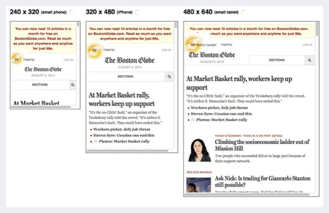
We briefly mentioned it earlier, but what does it really mean? Some marketers incorrectly equate mobile design with responsive design—but they’re not the same. Responsive design should be used across all platforms. It means that as screen sizes change, your content changes to fit within them. See this image (from the Boston Globe website across different platforms) as an example:
Useless Sidebars
On desktop, sidebars can be a great way to facilitate the buyer’s journey and improve the user experience. On mobile devices, however, they’re simply a distraction. It usually gets pushed down to the bottom of the page and is rarely used.
So, unless you can create a fancy sidebar like Google did, it’s probably better to remove it altogether for mobile users. See this CrazyEgg blog for more info.
Navigation menus and other elements on your desktop website may also need to meet the same fate. Again, try your site out for yourself and see what’s valuable--and what needs to go.
Accelerated Mobile Pages (AMP)
Though they haven’t been heavily-tested or widely adopted (yet), AMP pages may help you get ahead of the mobile marketing curve. These HTML pages follow a specific format and were developed by Google and its partner brands. These pages get priority in the search results of mobile users for certain relevant queries.
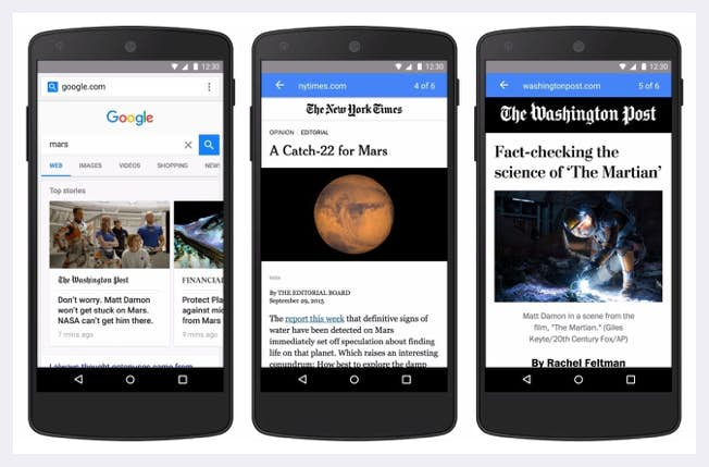
They’re extremely fast, and Google is encouraging companies to try them out. To see a demo, use your mobile device and search for something on g.co/ampdemo.
As mobile traffic continues to grow, it’s our responsibility as marketers to keep up with the trends to provide an excellent user experience, no matter what type of device they may be using.
Related
- Categories:
- Articles
- Web Design, CRO and UX
Upgrade to Power Membership to continue
your access to thousands of articles, toolkits, podcasts, lessons and much much more.
Become a Power Member- Login
- View Courses
- - - -
- Courses
- Resources
- - - -
- My Account
- Change Password
- Logout


